Brand Experience case study
From branding to development of the entire experience design
I started working on the project from its very inception, next to Graham Hill , the company’s founder. Quite literally, by the way, since the project was conceived in his tiny Barcelona apartment. Together, we devised the concepts behind the product. Our hands-on approach to all steps of the UX process helped TH become the leading online media company, which was later acquired by Discovery for 10 million dollars.
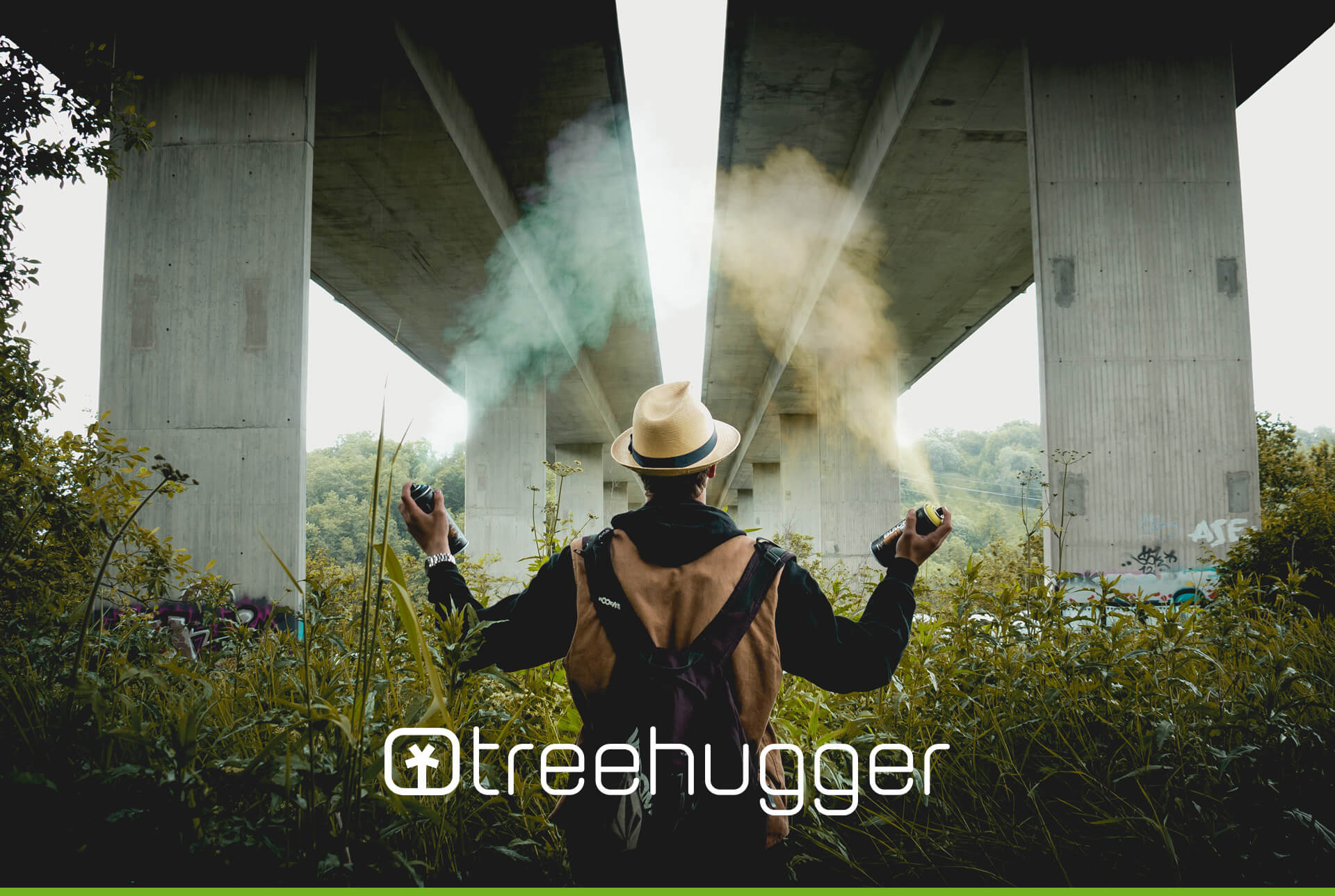
01 . What is Treehugger?
It is the leading media outlet dedicated to driving sustainability mainstream. Partial to a modern aesthetic, it strives to be a one-stop shop for green news, solutions, and product information.
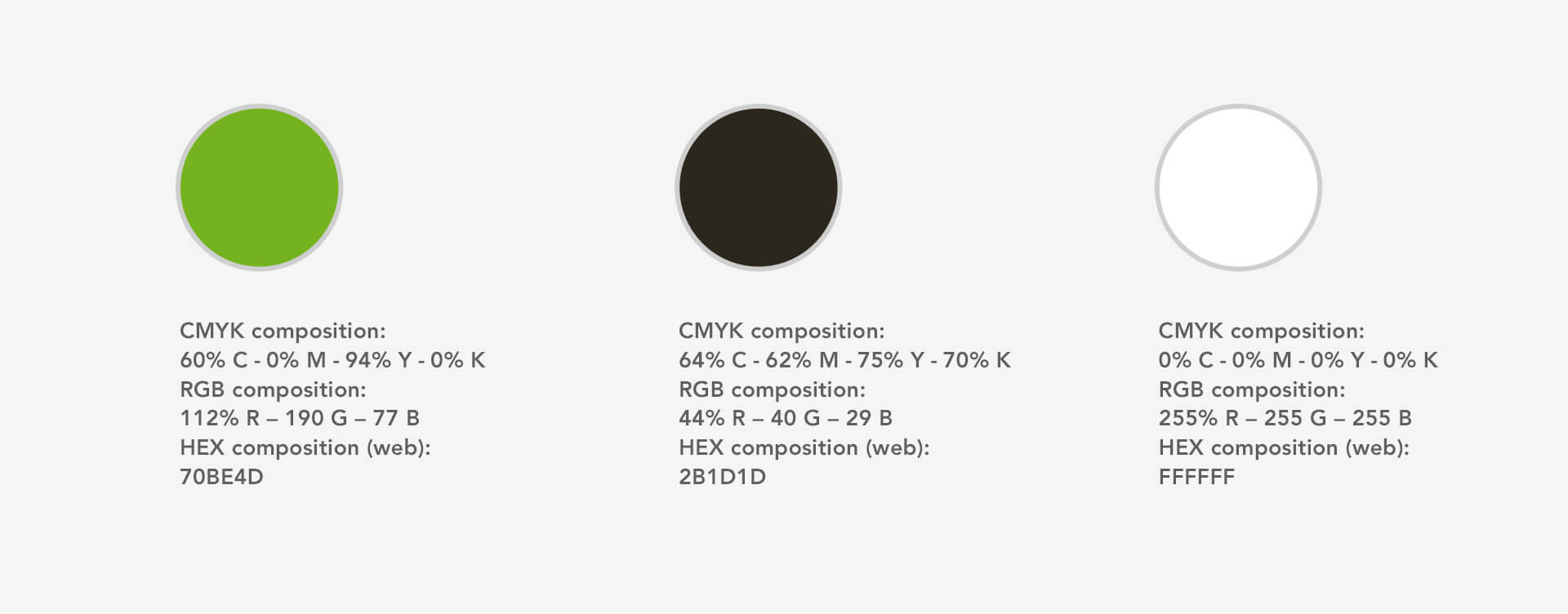
02 . The logotype
The word connotes a radical belief in green politics. By placing it in a more current context, its appeal is not only updated, but also introduced to the mainstream.
THE LOGO & ITS RECEPTION ON THE PRESS:
“This environmental logo stood out as unique among its peers as, although it is using a simple symbol representation, the high level of technical execution has made it a very powerful branding tool. It shows precision and simplicity in a snapshot, which is very refreshing… brilliant!”
— David Pache.
Also featured on LOGO DESIGN LOVE
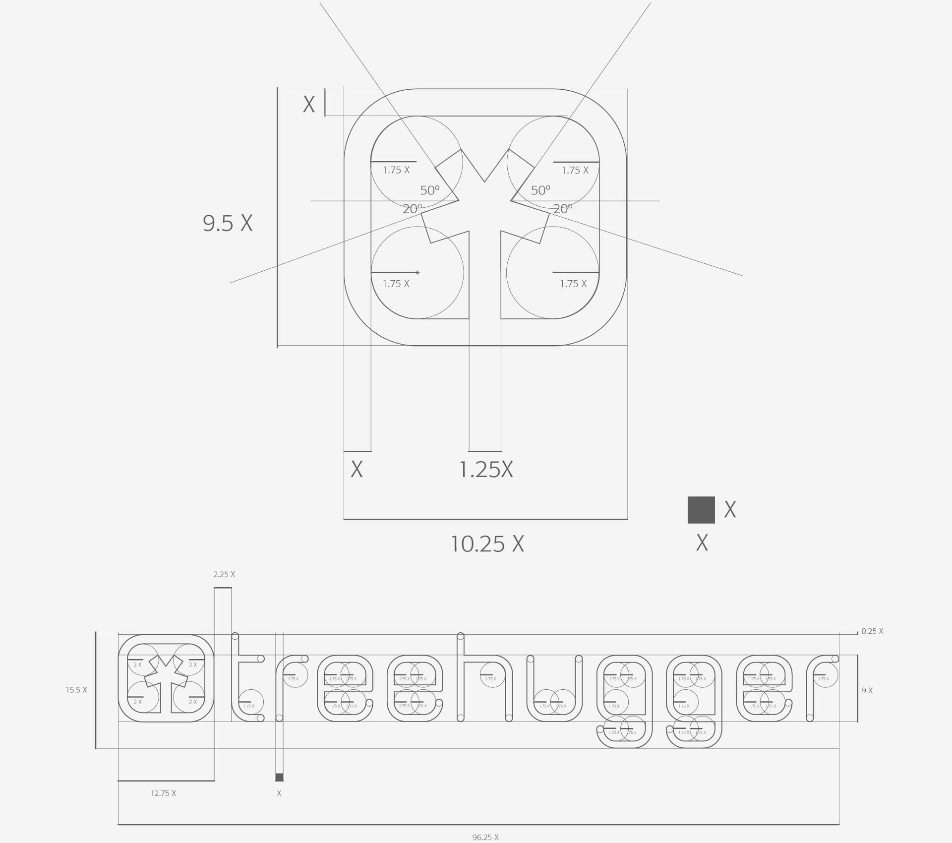
Icon and Logotype. Geometric construction and proportions.
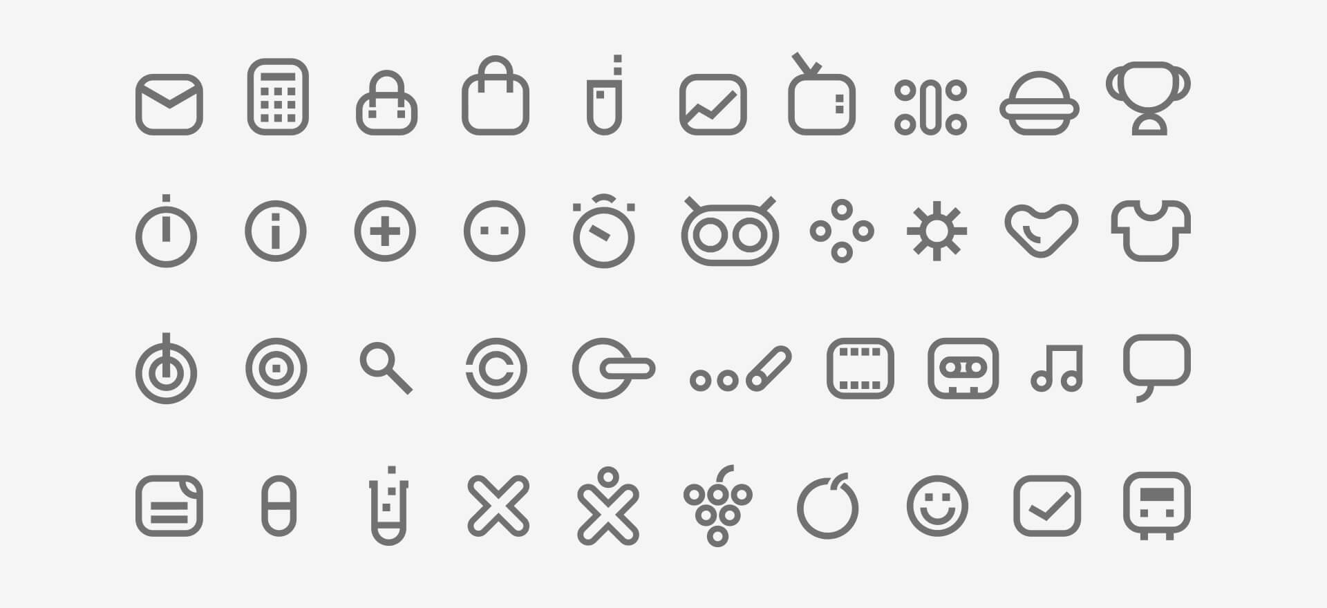
Iconography
A system of icons that works as a family. A cohesive graphic universe that helps to both signify and identify the various aspects of the product.
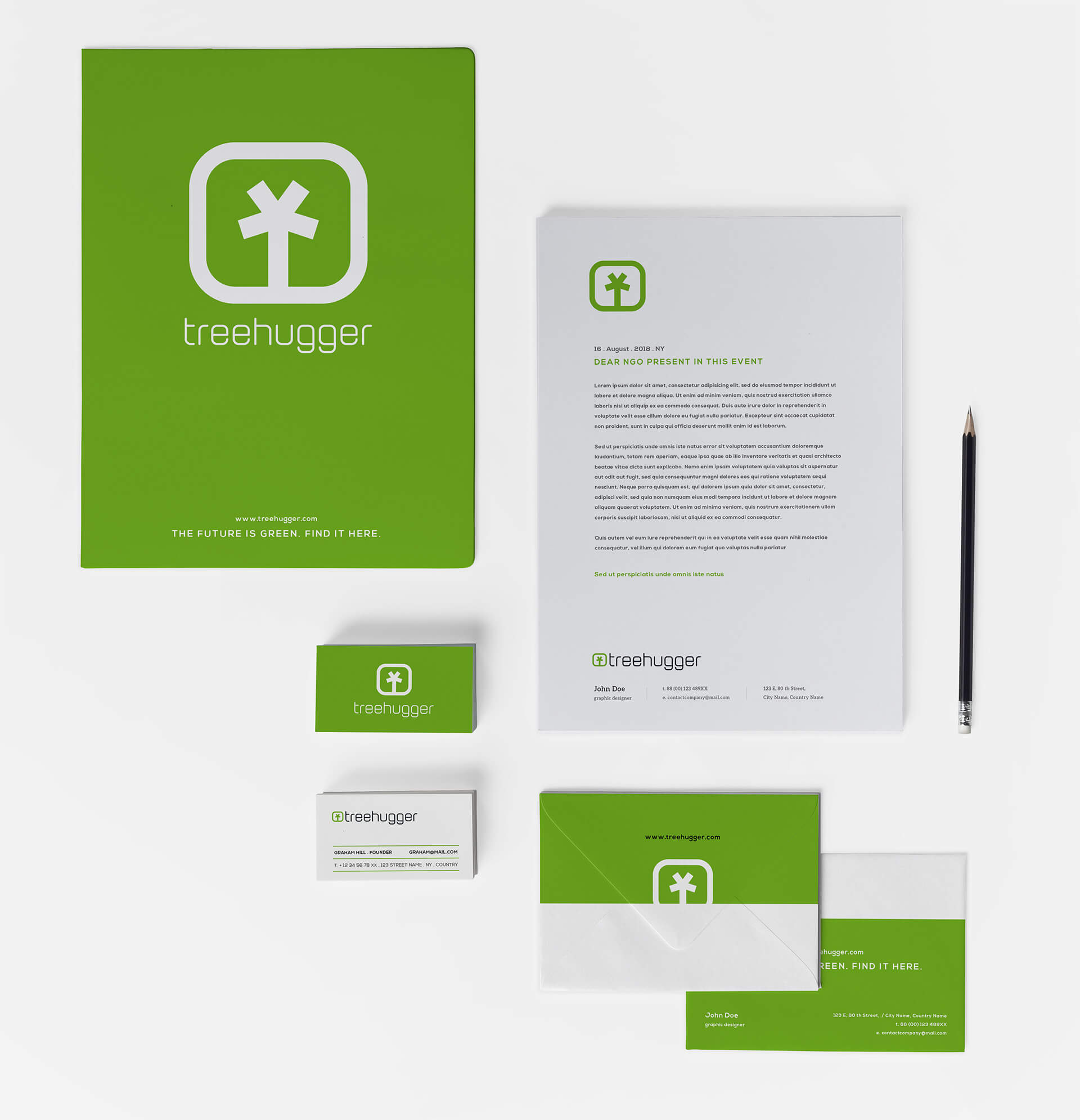
Business cards // Stationery

03 . Design & architecture
In addition to branding, we had to define the graphic universe that the user would later identify as the Treehugger experience.
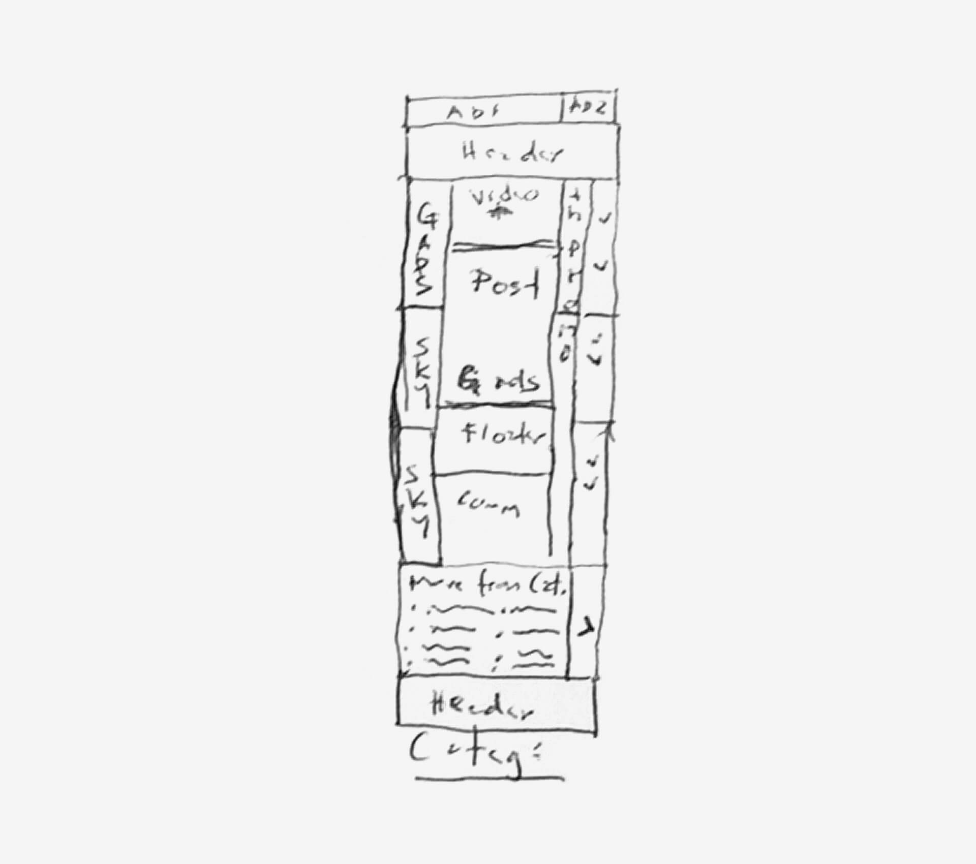
Low fidelity wireframing. Rough sketches.

After the Architecture & Information process is over. The first approach to the interface and visual design takes place.
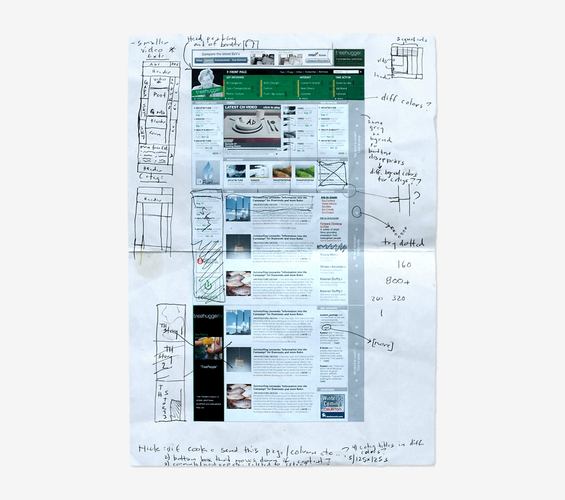
High fidelity wireframes. The information would be offered by way of a weblog, the way an actual newspaper would. This wireframe is a clear example of how to organize tons of information in a limited space.
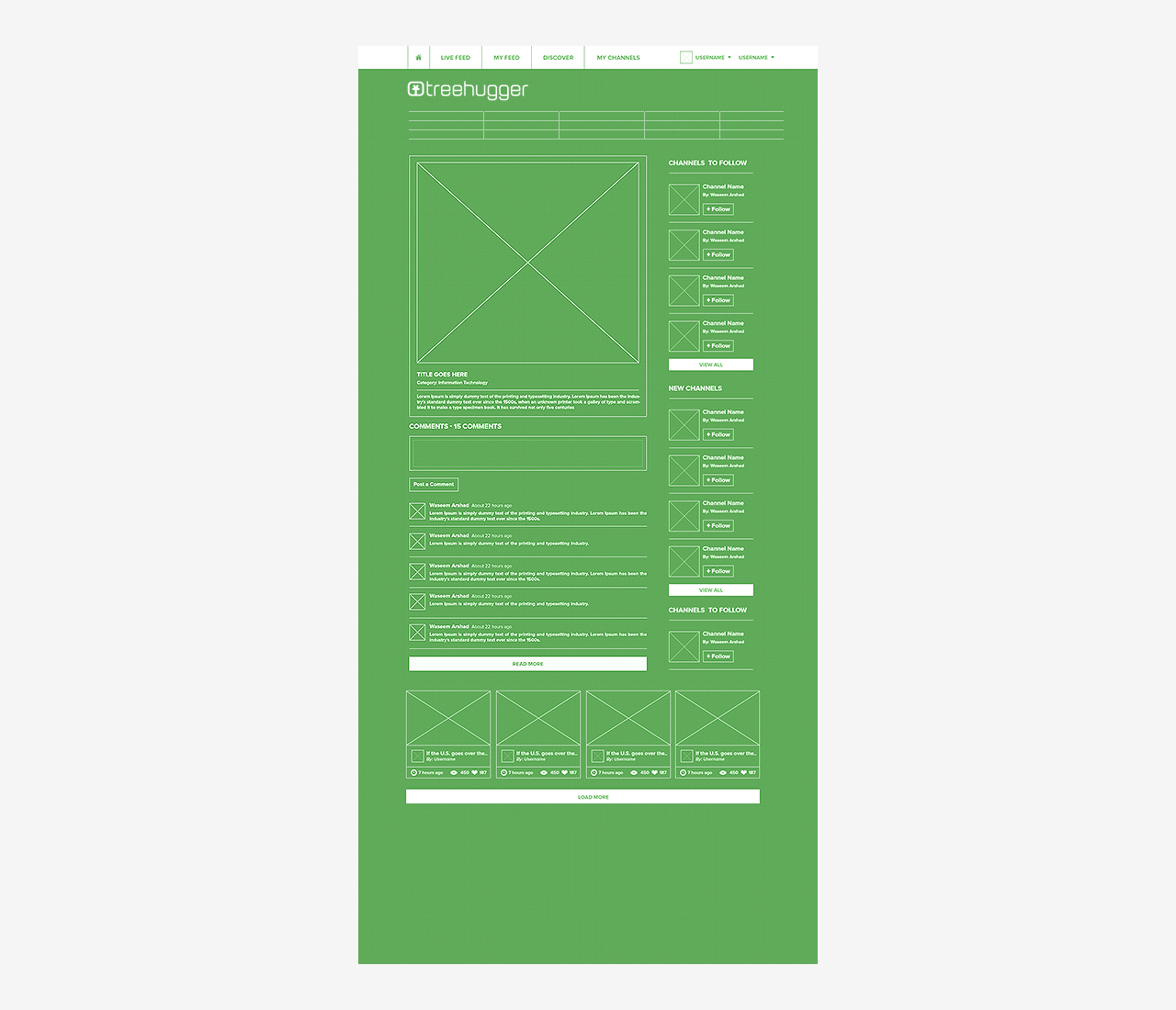
Homepage final UI design.
Each section has its specific purpose: some areas focus on branding, other sections feature ads and sponsors. Additional areas stress the ability to search and navigate the site.
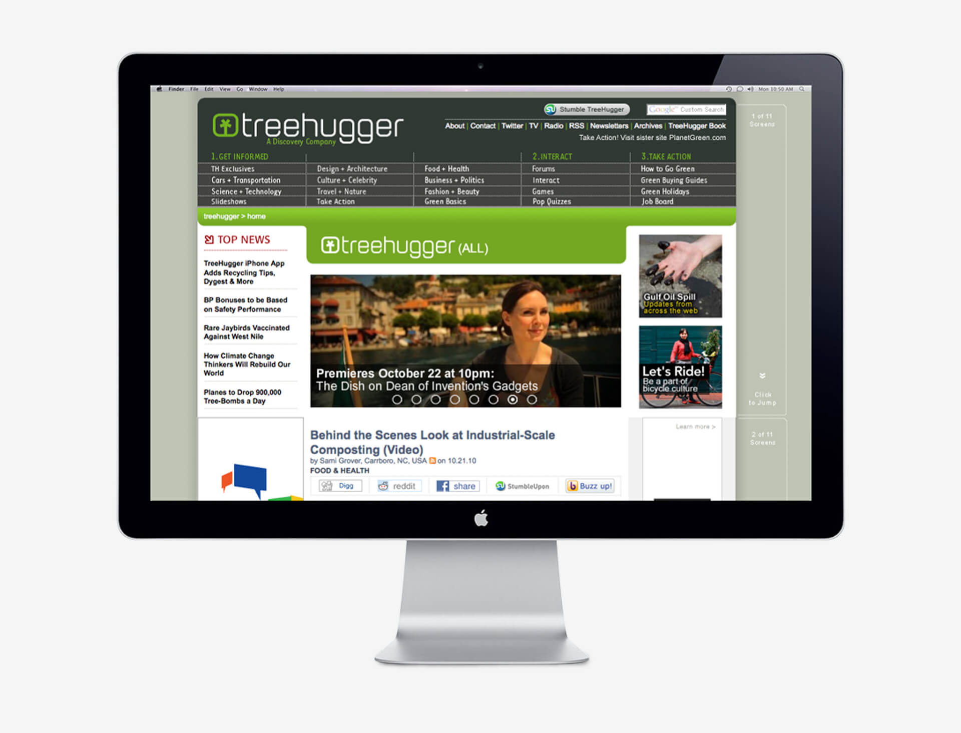
The main body of the home page.
04 . User Interface Design
Developing new and original ways for users to find content was an effective tool in allowing them to remain on the site for longer periods of time, increasing page views, remembering it later, and returning.
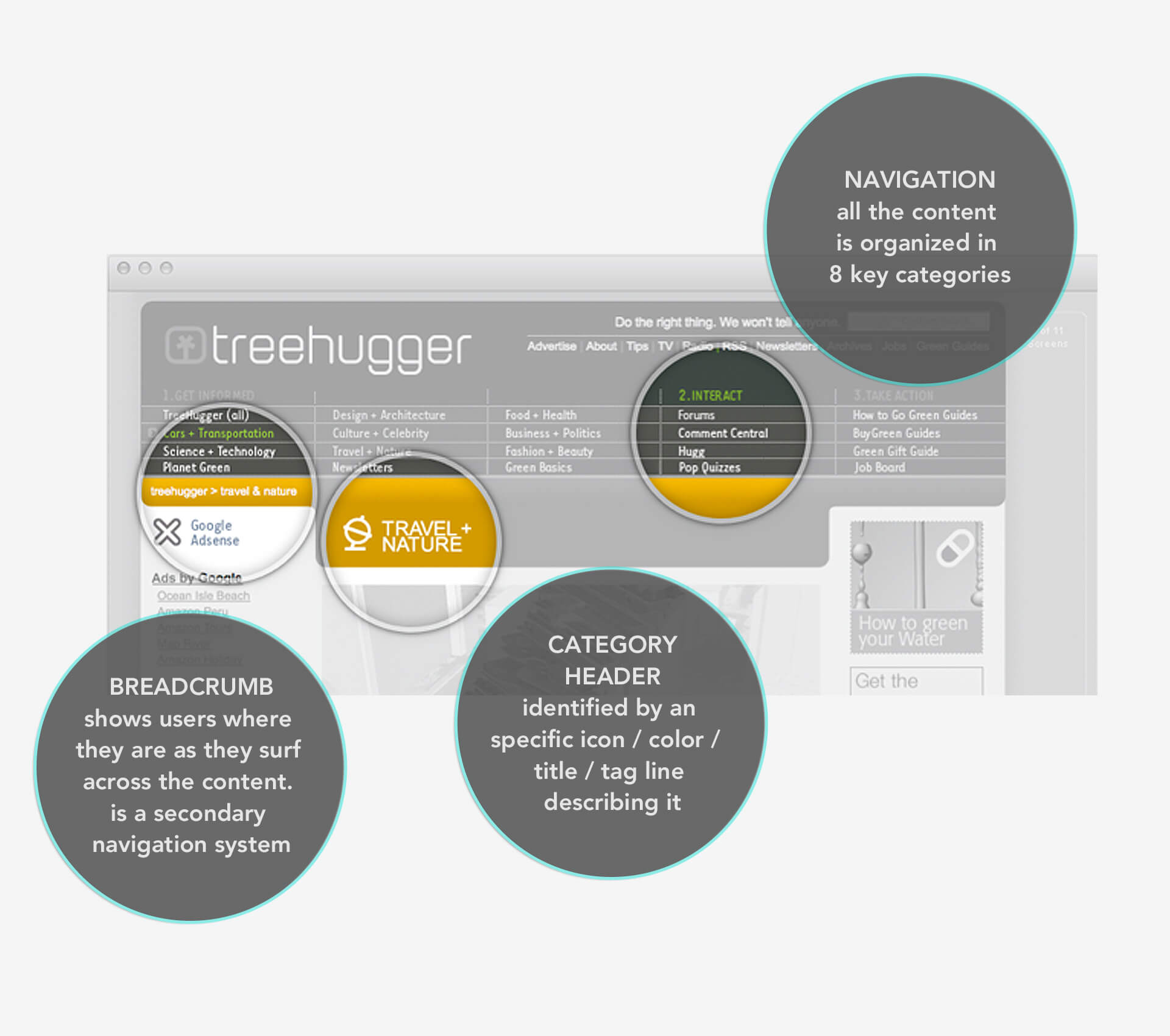
Navigation system. The entire content featured on the site was divided into 20 categories. Such a challenge proved to be helpful to writers who were able to focus on specific issues. It also allowed users to find content much faster.
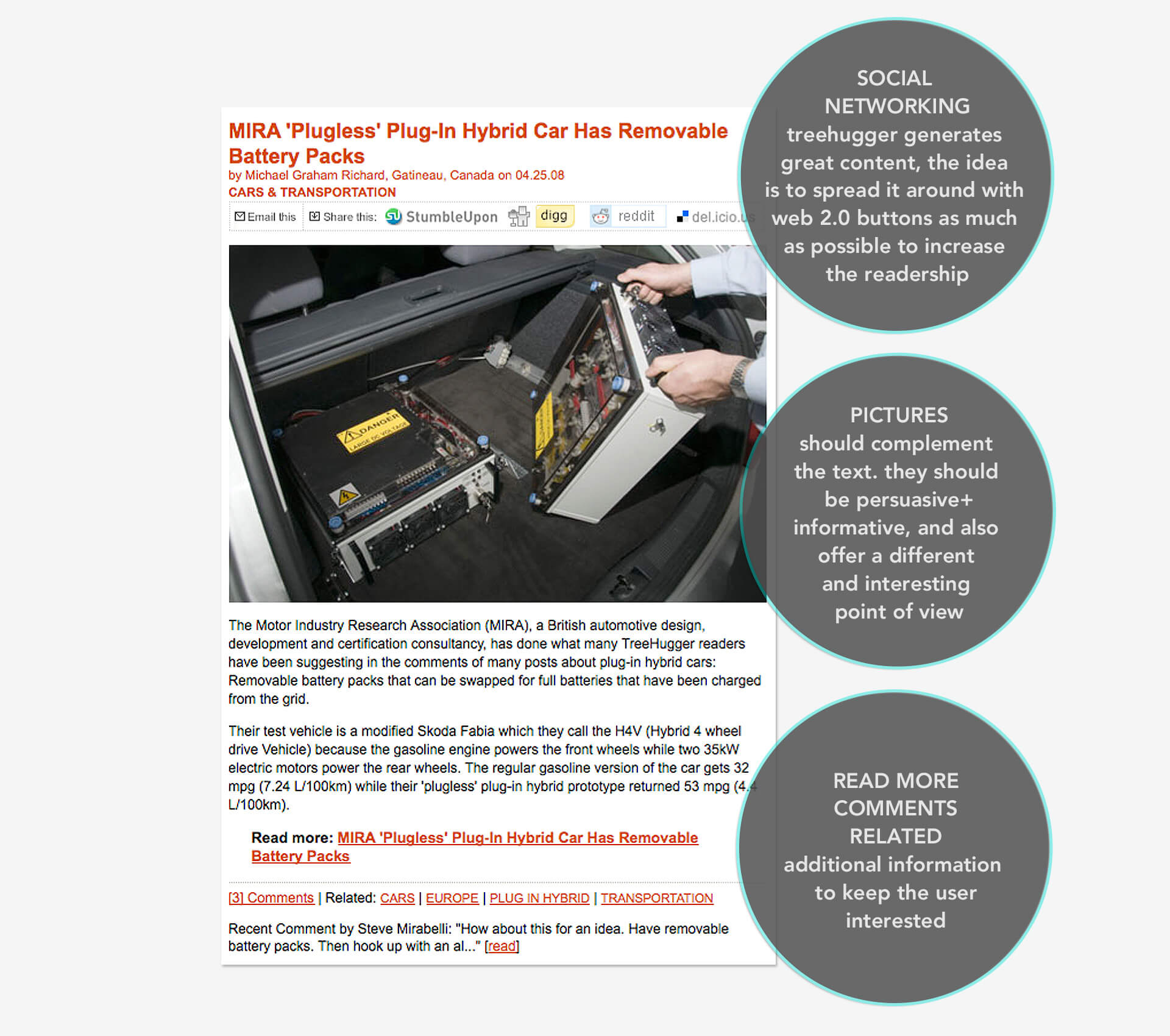
The Posts. They are the essential, basic units of information of the site. They are usually the first point of contact that users have with the blog, either through Google or other search engines.

Anchor tool. It was crafted and implemented as a new way of browsing the content, post by post.

Last chunk. Next page's content is promoted in order to keep the user on the site.
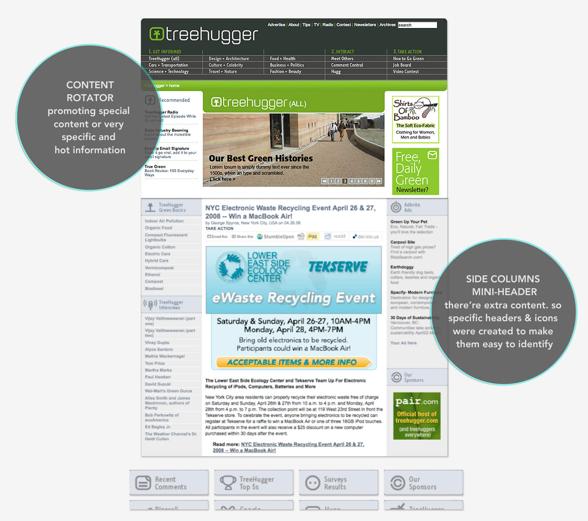
Mini headers. Side columns feature additional articles and information. Mini headers we created to improve recognition.
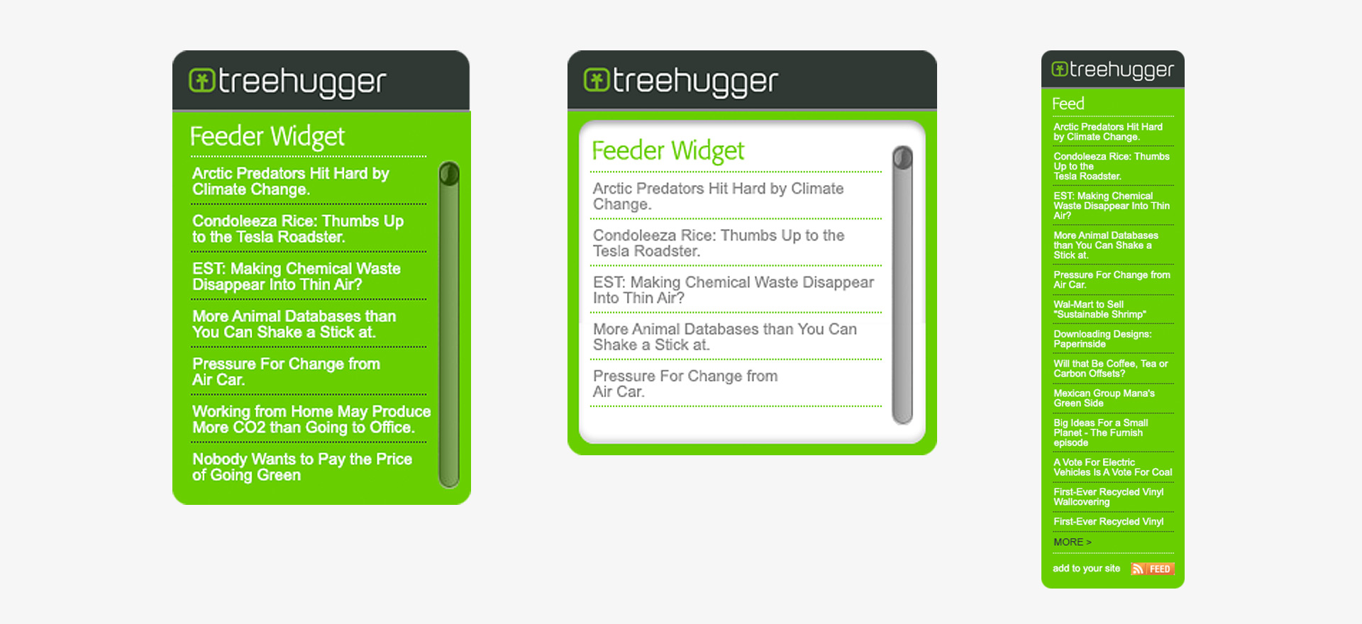
Widgets RSS technology and codification. Two widgets were created so that users would have direct access to online content right from their desktop. These could also be inserted into any blog, thus creating new partnerships in content.
05 . Marketing
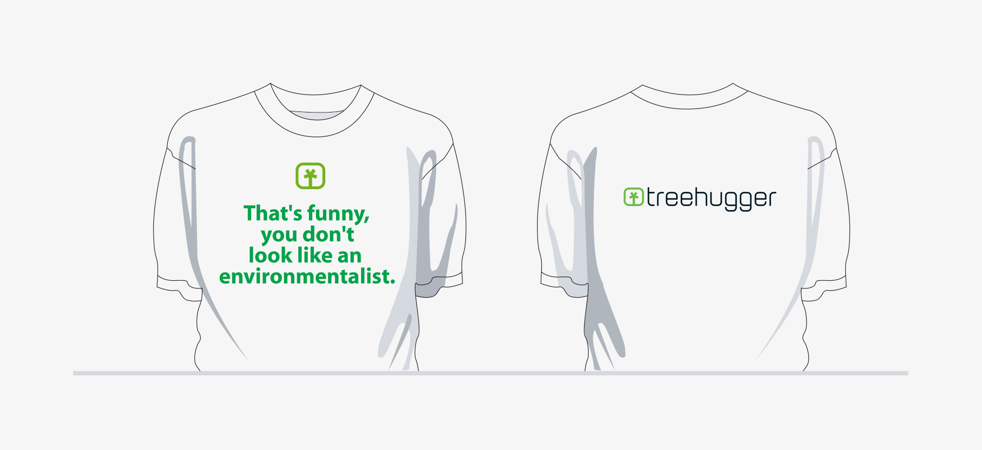
The usual advertising channels (and some less conventional ones) were used to promote the site, both online, on paper and other mediums.
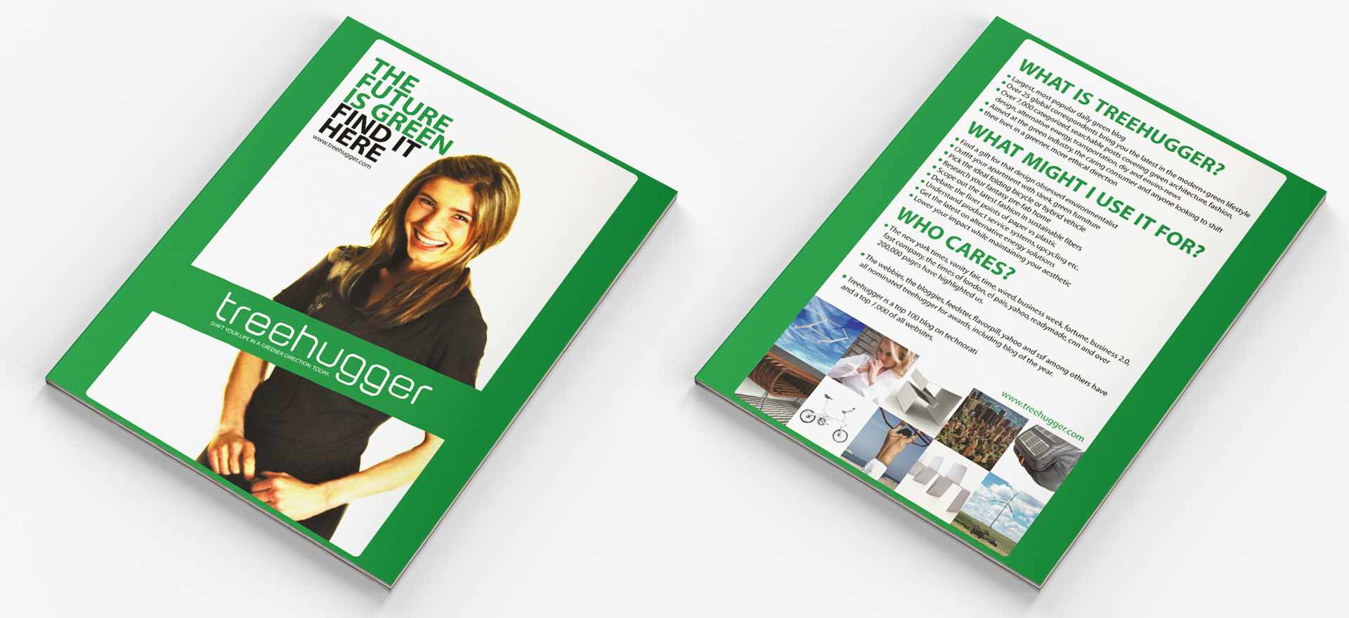
Ads. A selection of two ad campaigns that were featured on magazines.
The Posts. They are the essential, basic units of information of the site. They are usually the first point of contact that users have with the blog, either through Google or other search engines.


BOOK. A compilation of articles edited in a book format became an innovative promotional tool that strengthen the brand and its values.


Promotional banners. An assortment of banners that were designed to promote the different aspects of the site.
05 . The Results
Statistics / Press / Awards
THE NUMBERS
10 staffers
50+ writers worldwide
10+ countries coverage
31 posts per day
13,000+ articles across 8 key categories
49,000+ reader comments
60,000+ total newsletter subscribers
31,000+ rss feed subscribers
5,212,000+ page views
2,628,000+ unique visitors
#22 technorati rank (out of 75,000,000+ blogs)
THE GREENEST OF ALL
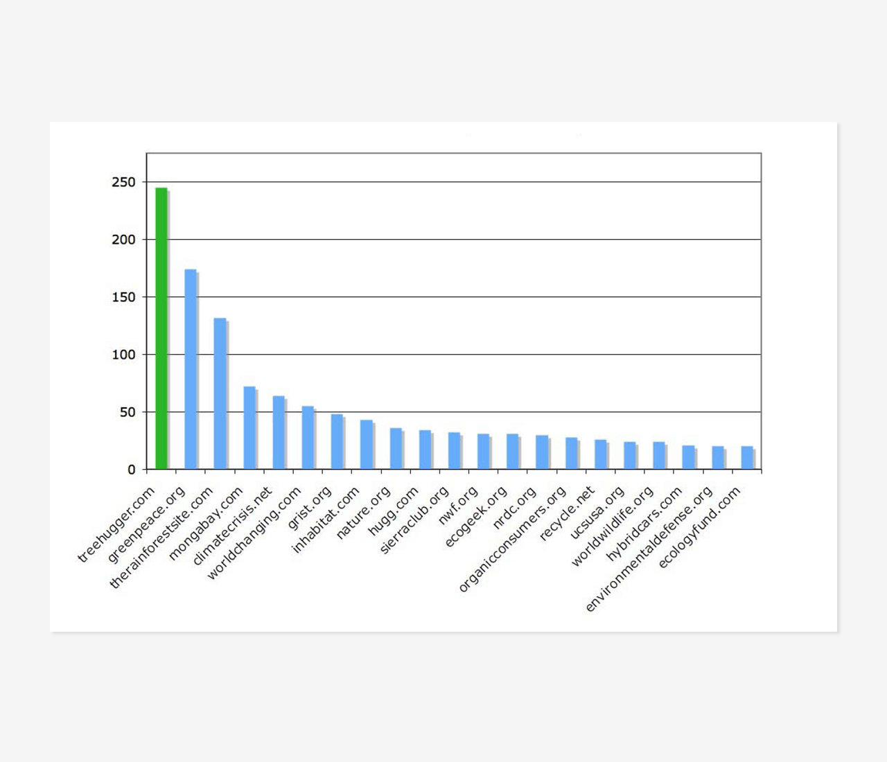
Leader. After having positioned itself as the leading media outlet for sustainable living and green news, TH was later acquired by Discovery Communications for US$ 10 million.
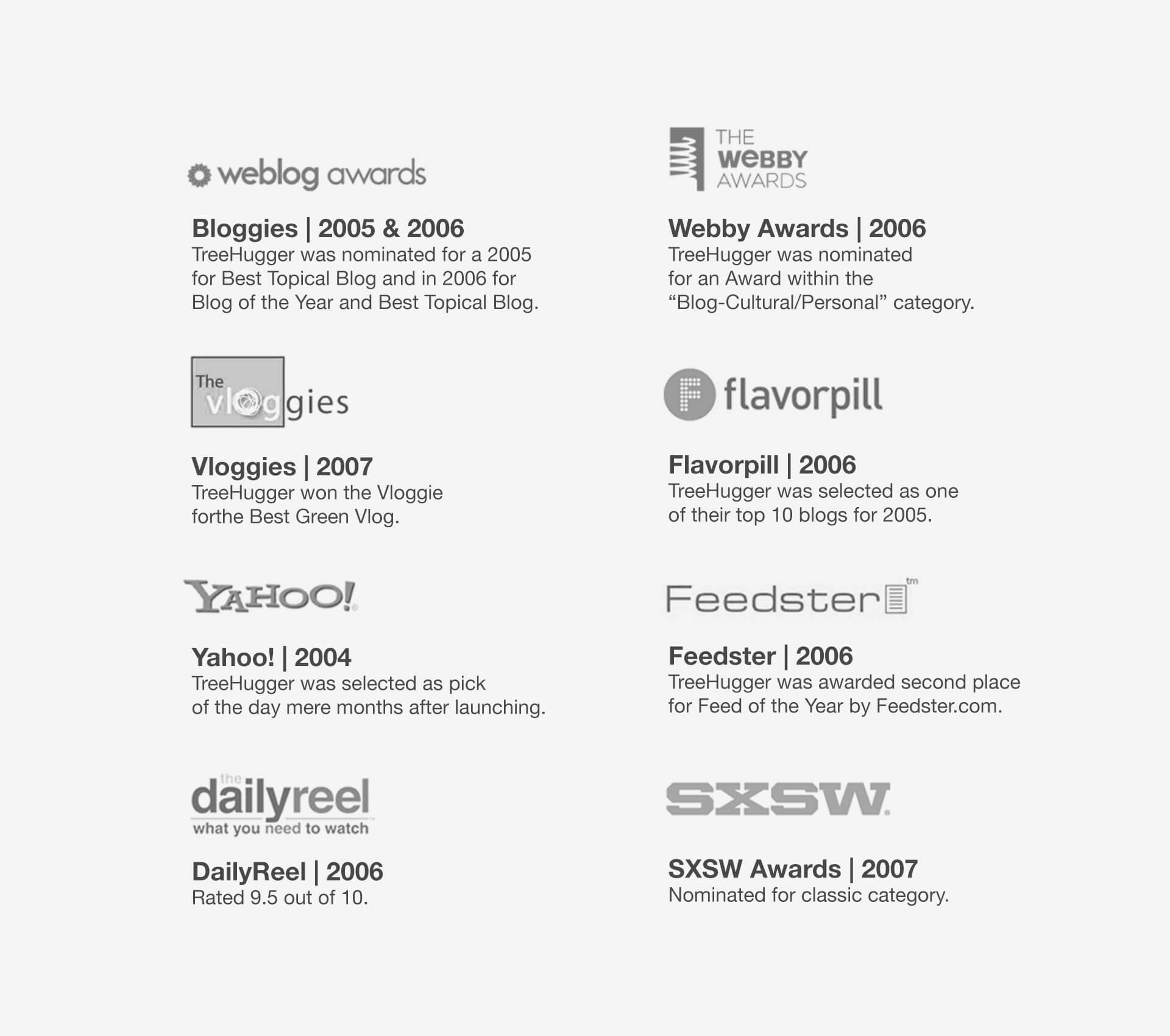
AWARDS
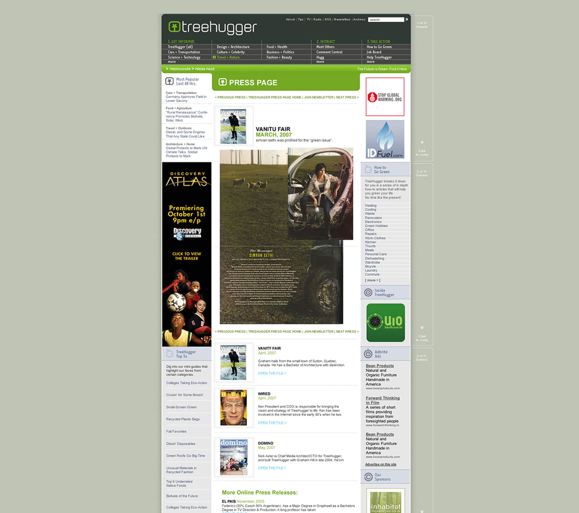
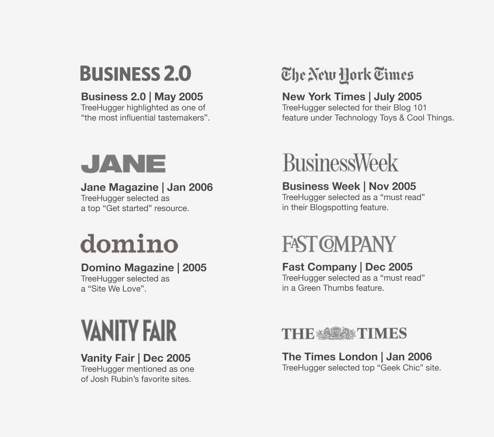
PRESS
Conclusions / Solutions
Discovering the global impact of my designs was both revelatory and thrilling. I had the unique opportunity of designing a template of what was to become an instrumental medium for green news. It helped propel sustainability into the mainstream.
It is rare for a designer to have such a first-hand opportunity to use his skills in order to articulate a voice for change.
TreeHugger.com
The blog has over 5M unique visitors and 15 million page views per month. With 40+ writers in 10+ countries, it has a finger on the pulse of the growing sustainability movement around the world.
Role + Location
Head of UX + UI / Online Art Director
New York
Skills
- UI User Interface + Visual Design
- Multiplatform Mobile Apps & Multiplatfoms
- Art Direction Art & Creative Direction
- UX User Experience
- pixel perfect GUI Design + Pixel Perfection
- wireframes Wireframing
- branding Branding System
- Identity Identity & Brand Guidelines
- Typography Typography + Iconography
- web designs Web Design
- Interactive Design + Usability Interactive Design + Usability
- Information Architecture Information Architecture
- Ideation & Conceptual Development Ideation & Conceptual Development
- Creative Suitecase Creative Suitecase Ninja
- Business Business Understanding
- Projects Projects & Small Teams Leading