
A system of icons developed from a UX perspective
A family of icons (as a system) is a key element for every user experience. A consistent and compelling iconography always adds significants and values to the product.
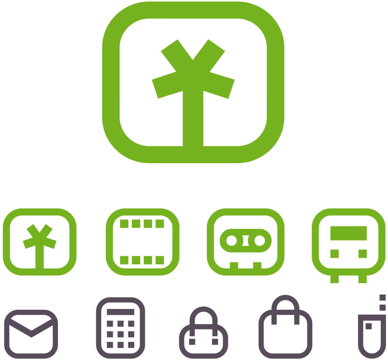
A family with a purpose
An example of a subsystem of icons specifically created to be part of a product belonging to a brand.
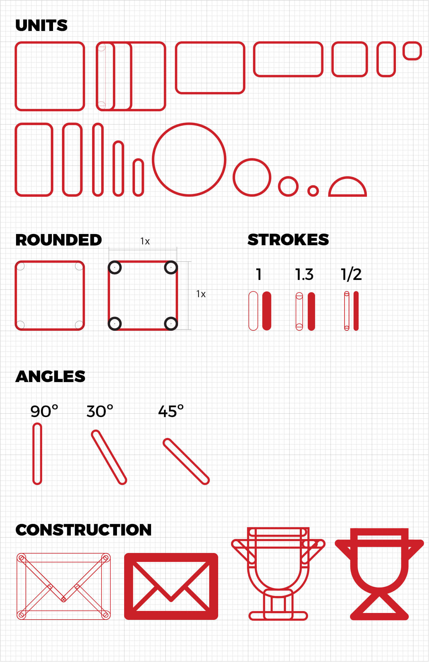
Grid + Modular generation system
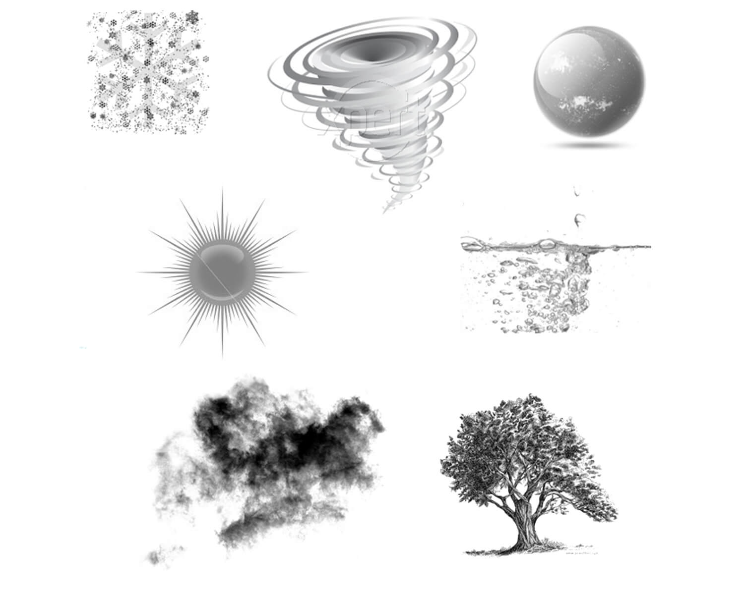
The icons were developed from a family of shapes and modules.
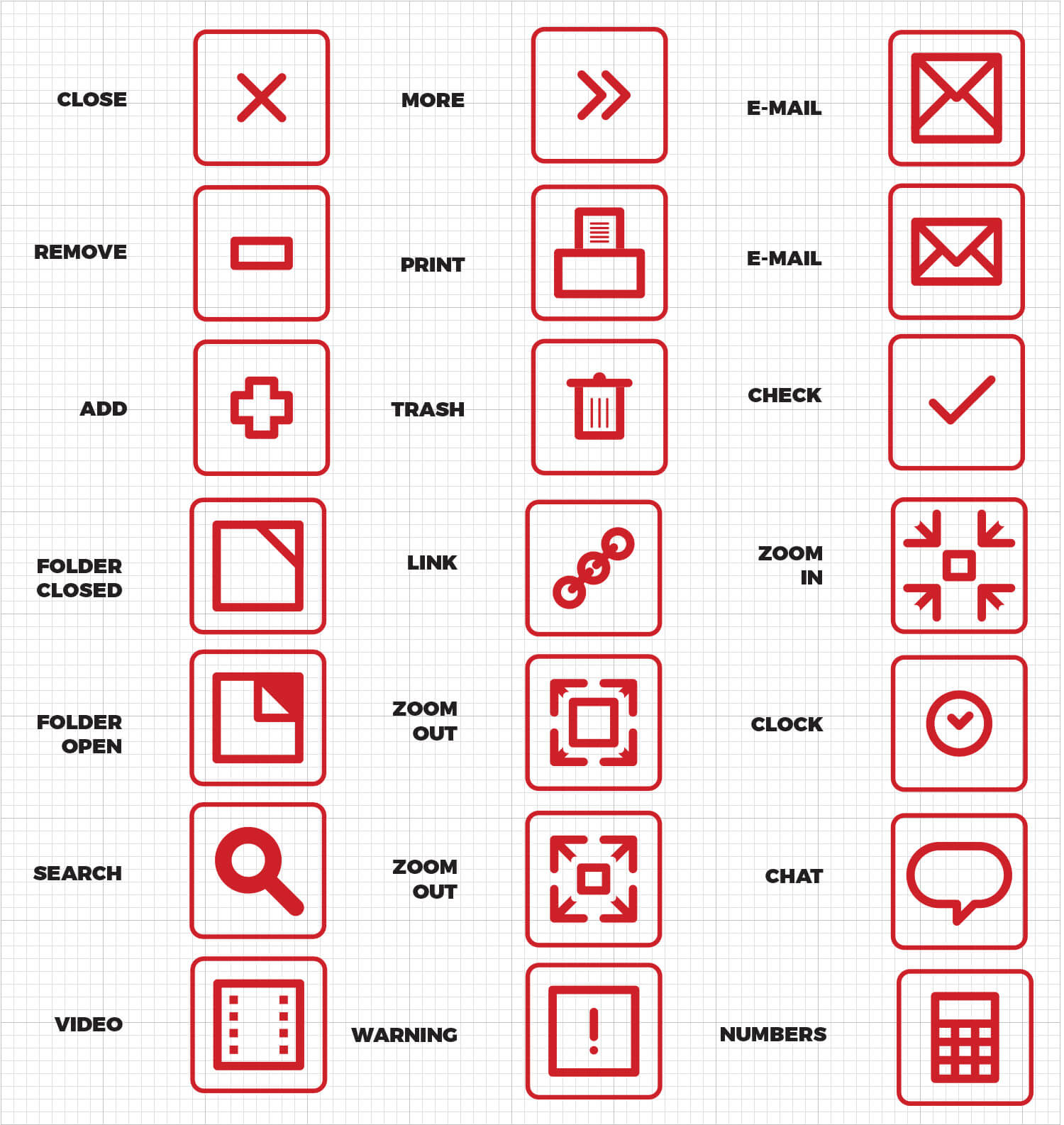
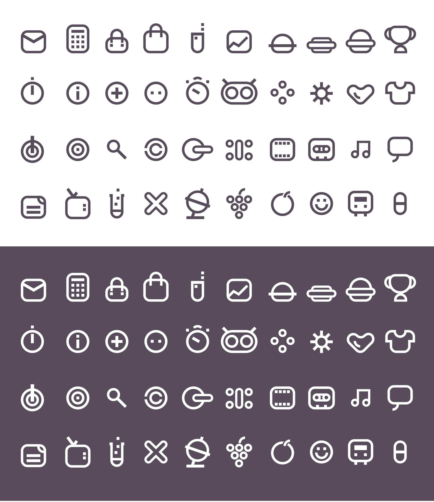
Sub system
This system of weather icons was created from the modular+grid design system.
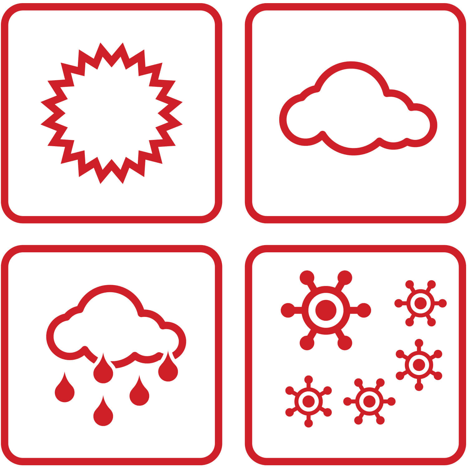
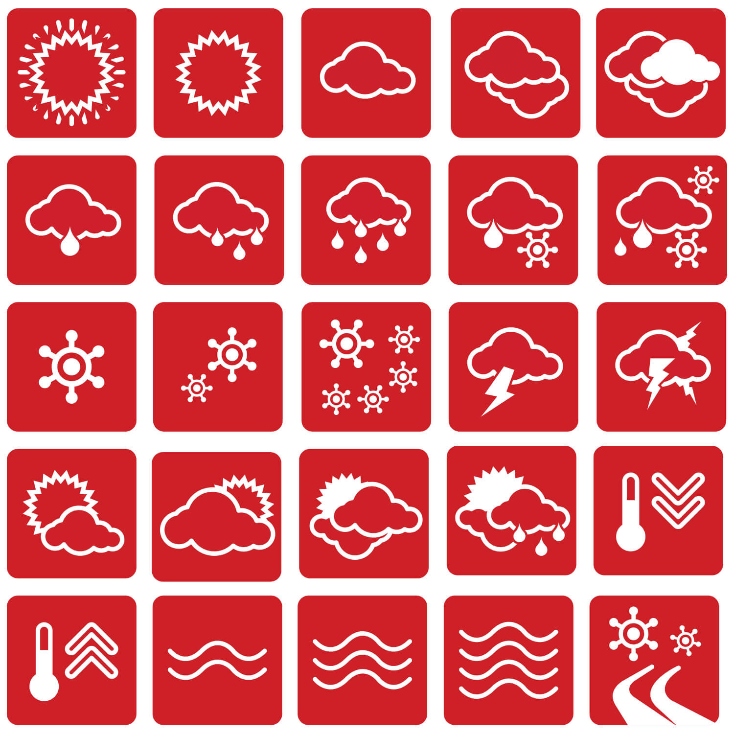
Legibility. All shapes and lines are perfectly balanced and spaced.

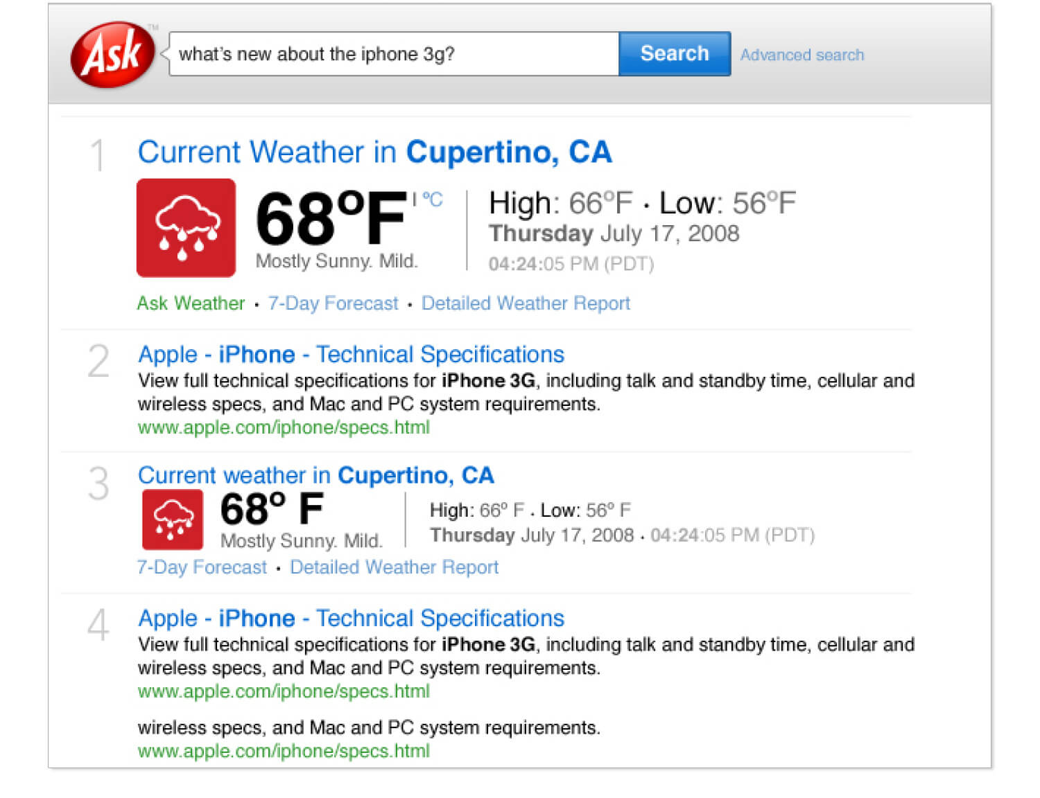
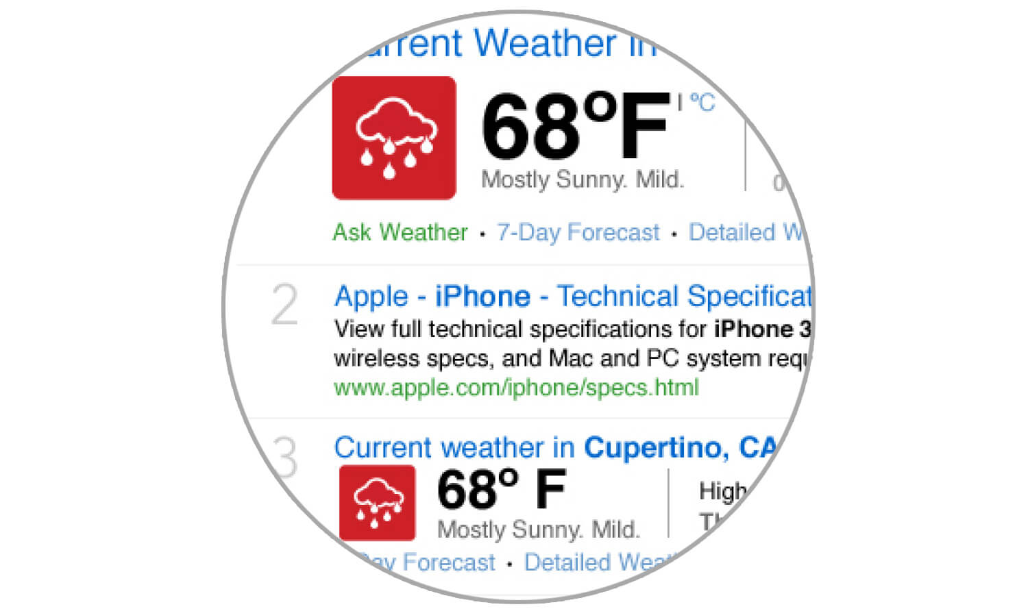
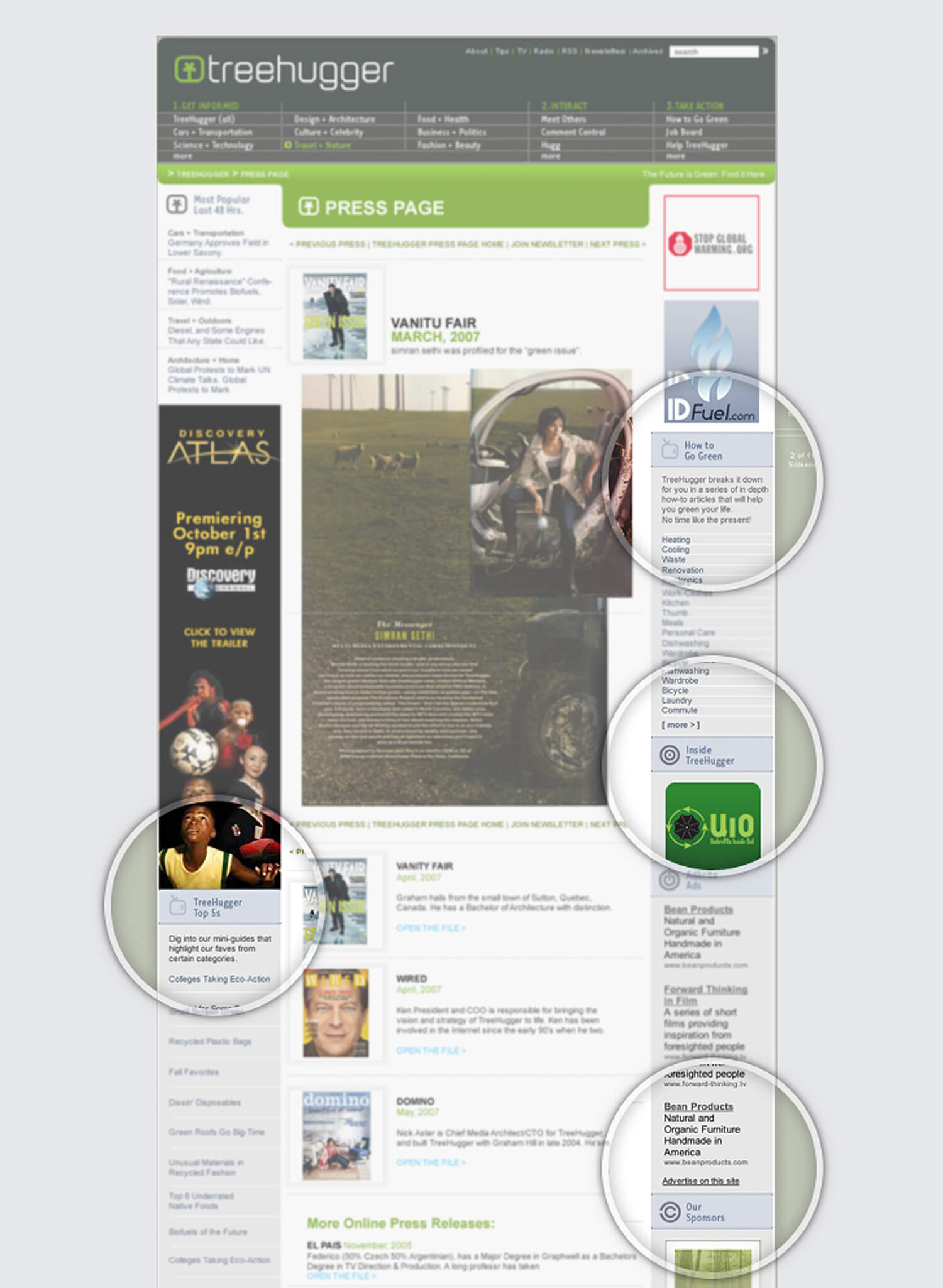
Icons implemented
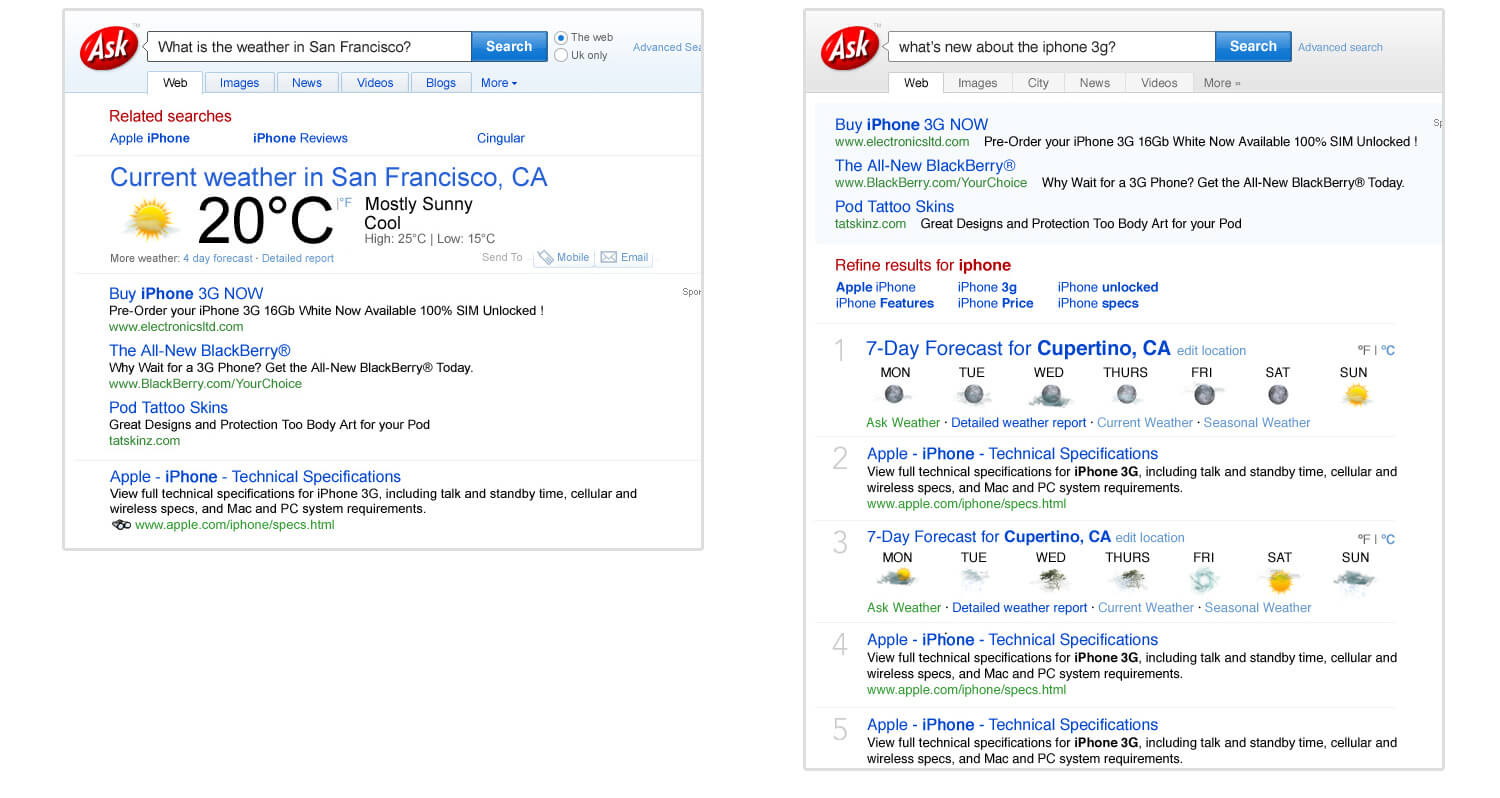
Examples on the SERP page.
The logo as a starting point
One of the best ways to generate a consistent family of icons is to base them on the same morphology.
The logo and its derivatives
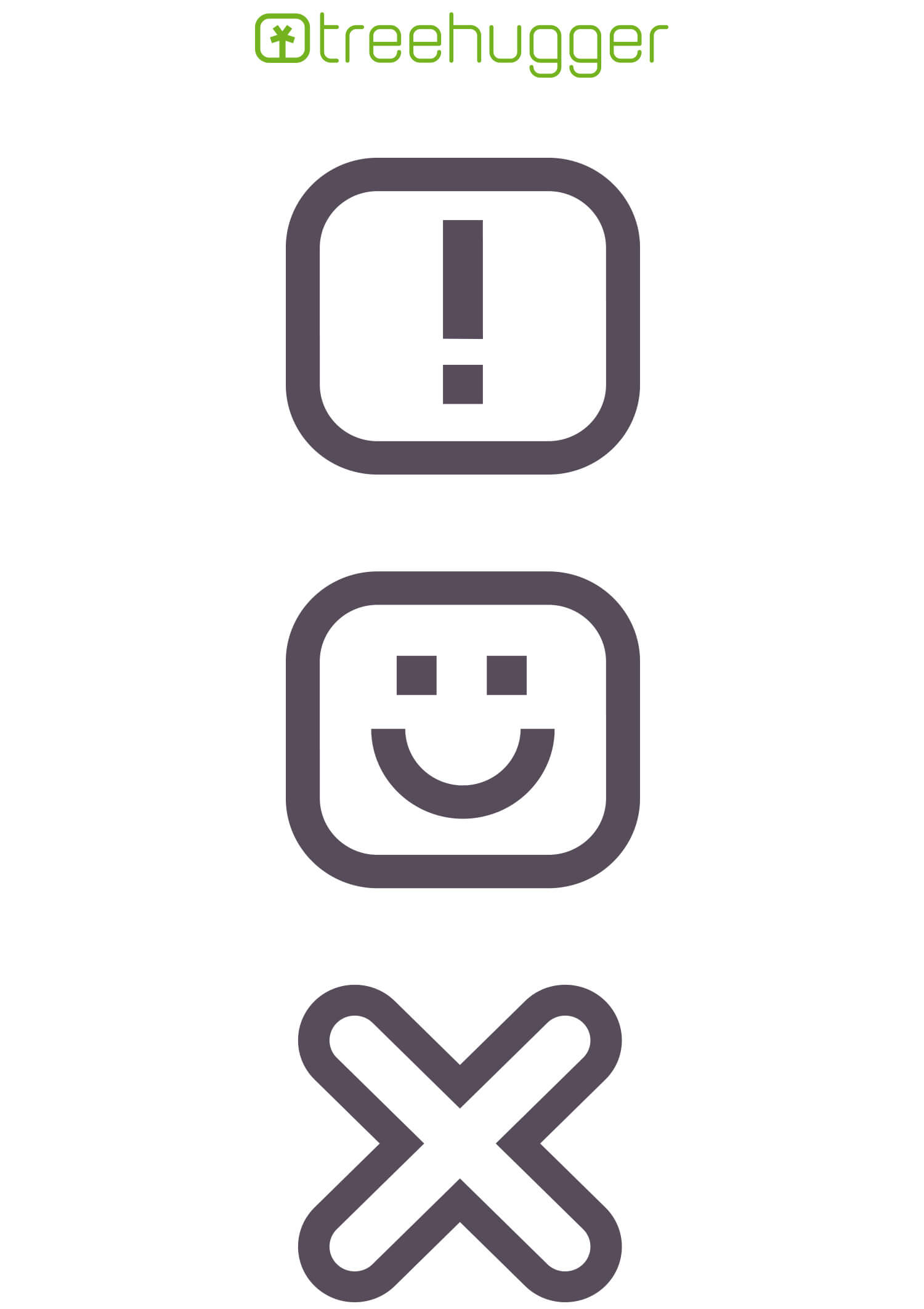
Inverted version. Created to perfectly work on both contrasting backgrounds.
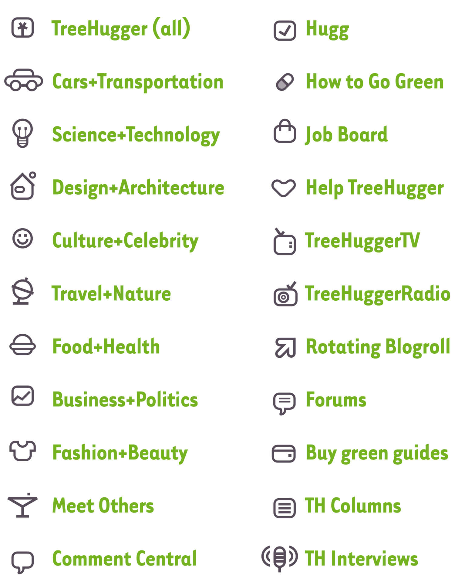
Category icons. Applied to the SERP page.

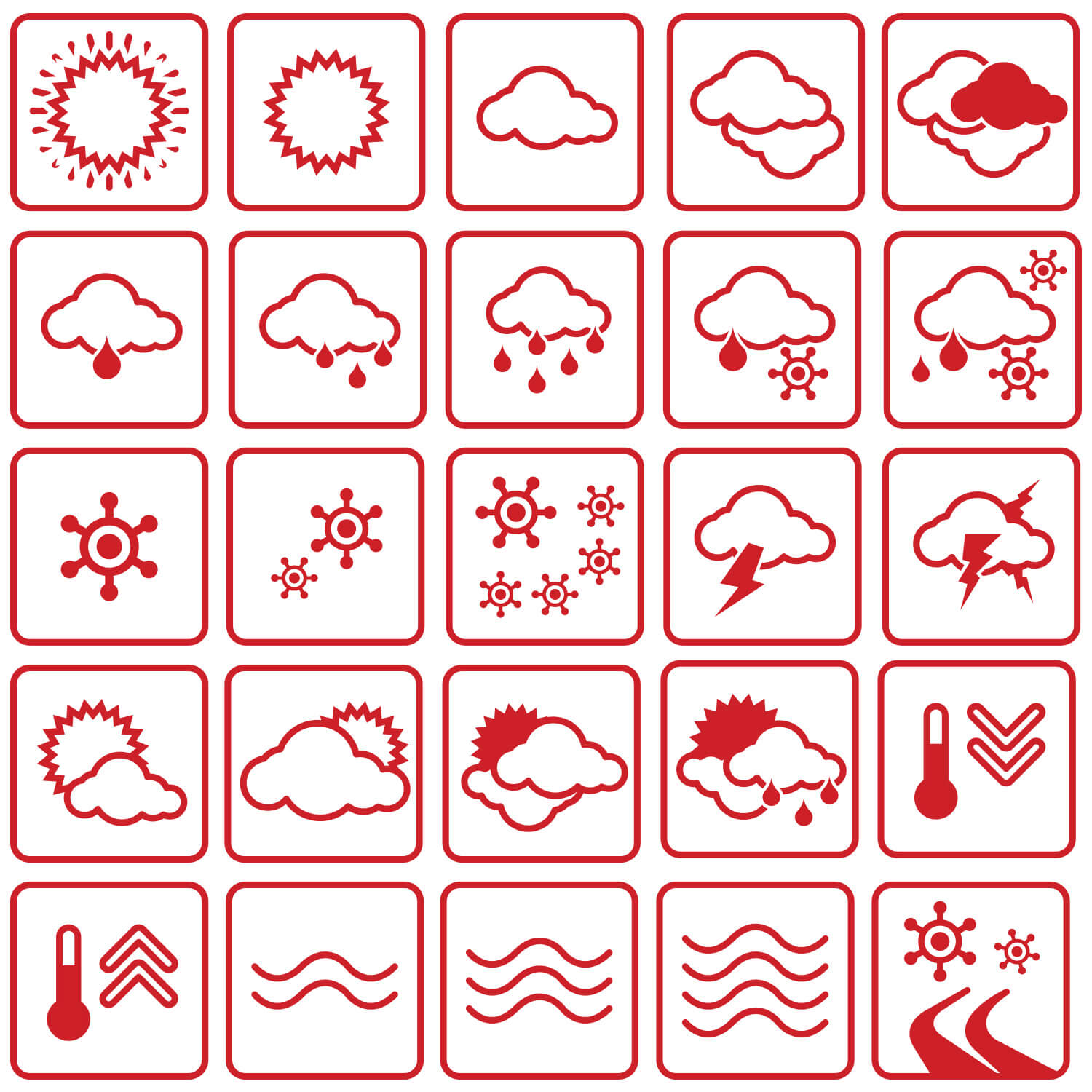
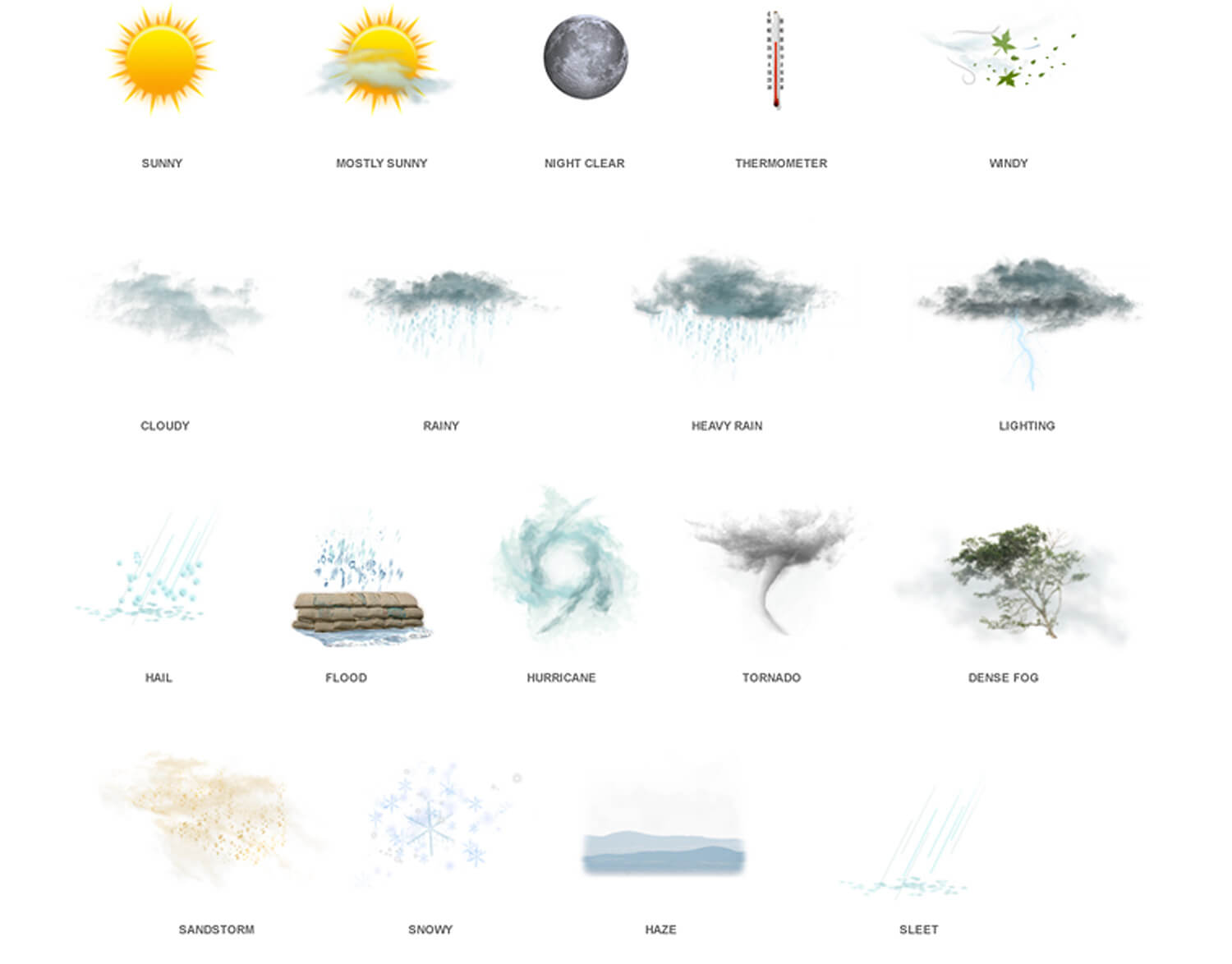
Photographic weather icons
The Ask.com's Weather Team wanted to create a new set of icons as part of their product strategy. The search engine needed graphic elements that would improve, not only the user experience design, but also the branding experience as a whole.
Brainstoming + Benchmarking: As on every design job, the research stage is essential. We must consider competitors & inspirational styles. Here's a selection of those examples that I found inspiring.
Creating an icon
On some icons I started from square one. In other cases, some retouching of existing images was required.
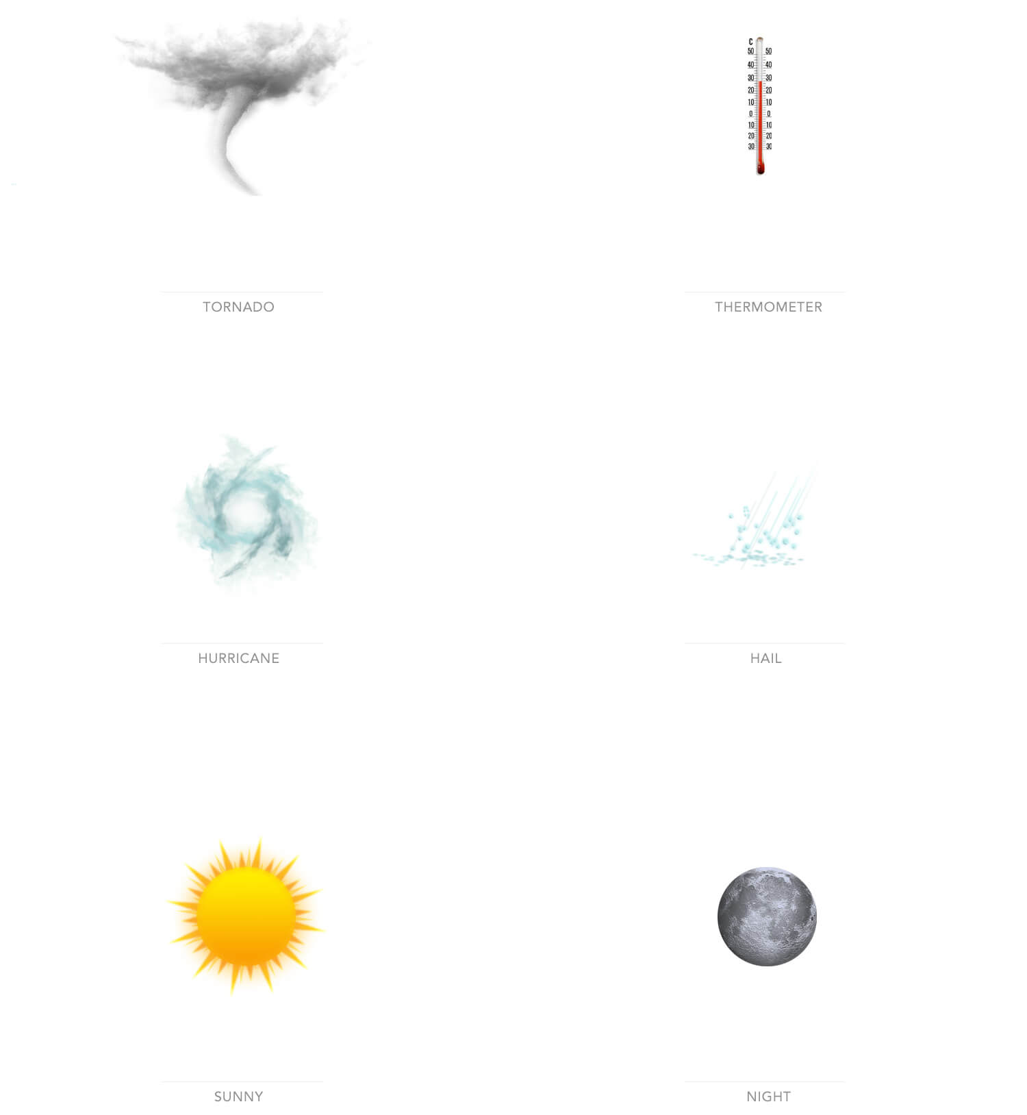
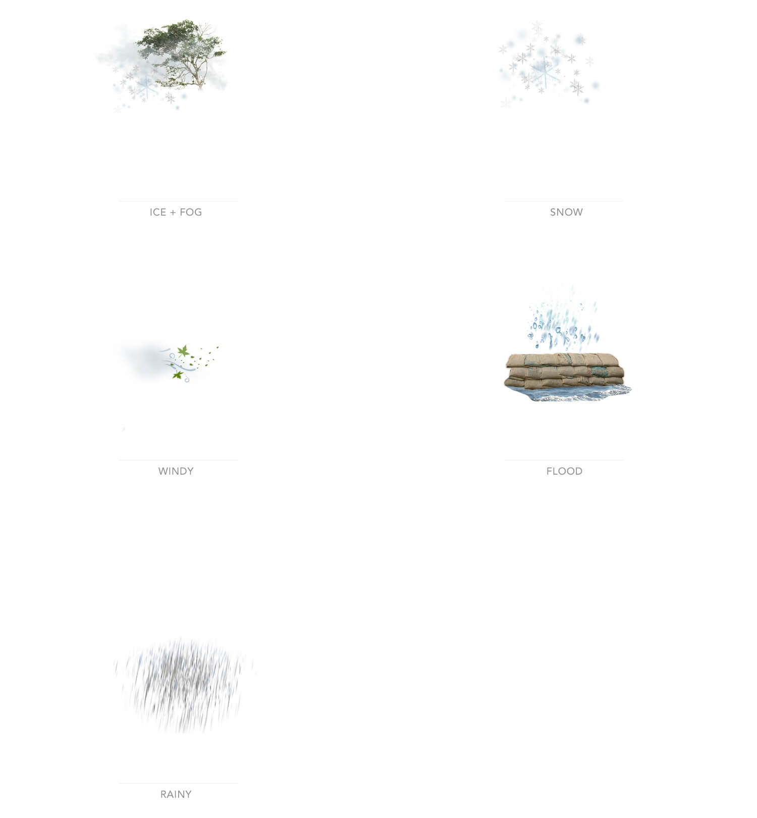
Complete set of icons
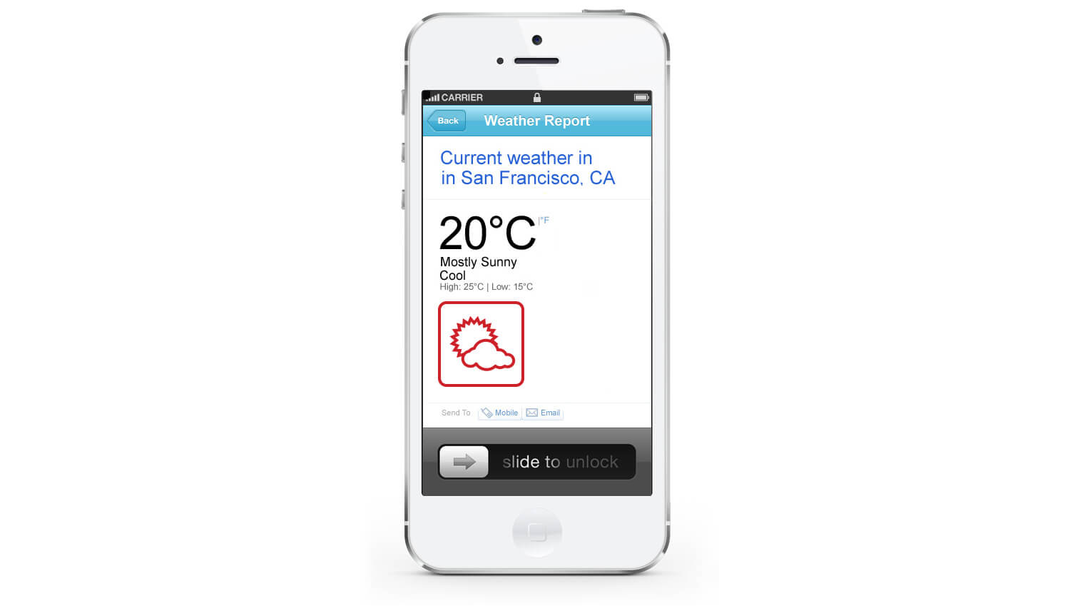
The final destination of this set of icons, was the SERP on all platforms.
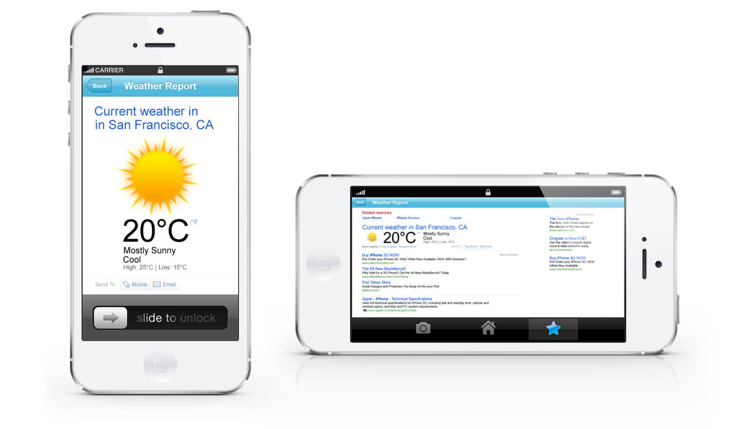
On iPhone. UI Design prepared for smartphones.
Conclusions / Solutions
I developed a set of weather icons in a variety of styles. The photo-realistic ones were the prefered choice, after usability studies conducted by the company determined so. The most interesting aspect of this project was being able to fuse my experience as a photographer with the need for a realistic approach in our design.
A uniform system, or a subsystem of icons is always designed with the same criteria used for all other modules and elements on the site. A modular, or any other systematic way of ideation, ensures a solid construction basis for new icons needed by designers seeking quick and consistent experiences.
Skills
- UI User Interface + Visual Design
- Multiplatform Mobile Apps & Multiplatfoms
- Art Direction Art & Creative Direction
- UX User Experience
- pixel perfect GUI Design + Pixel Perfection
- wireframes Wireframing
- branding Branding System
- Identity Identity & Brand Guidelines
- Typography Typography + Iconography
- web designs Web Design
- Interactive Design + Usability Interactive Design + Usability
- Information Architecture Information Architecture
- Ideation & Conceptual Development Ideation & Conceptual Development
- Creative Suitecase Creative Suitecase Ninja
- Business Business Understanding
- Projects Projects & Small Teams Leading