
Product Design: wearable
The first clinical grade wearable device to help expecting moms
I collaborated with Zinc-group, on the visual development of the pregnancy app from scratch. We were approached by Bloom Technologies to help with the full design of a new wearable system for pregnant women.
01 . The Challenge : Smart Pregnancy Wearable
Early stage: research and in-depth analisys of the user + product needs + tech requirements
02 . The Analisys
Define needs, translate into a functional architecture, creata a set of documents that reflect the App: This project required an iterative process of user research, prototyping and testing across hardware and software.
Technical aspects. Hardware features included in the device were cleverly put into use.
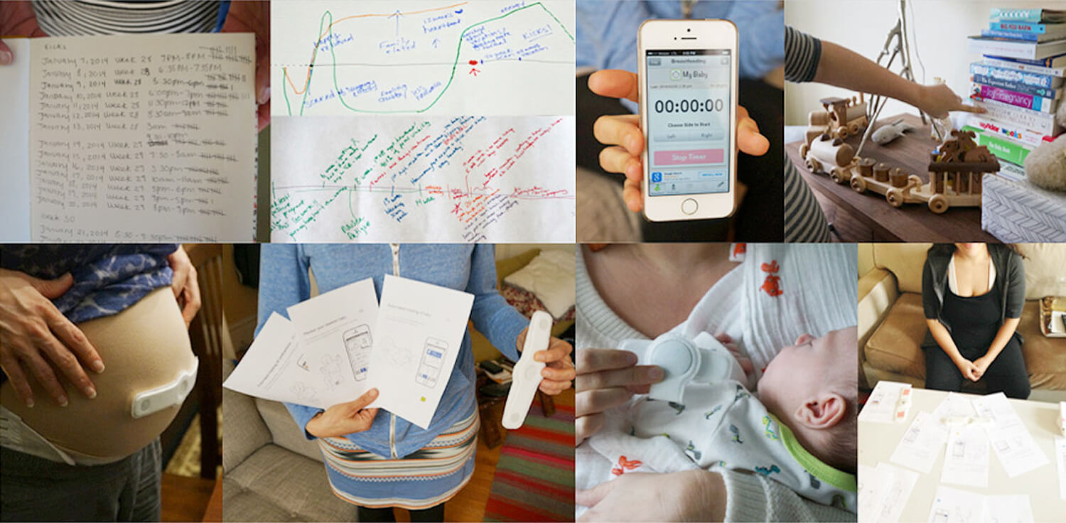
User Research. Concept evaluation sessions with pregnant women and care experts.
Workshops. To define the user, technology and business insights that drive the design of the system.
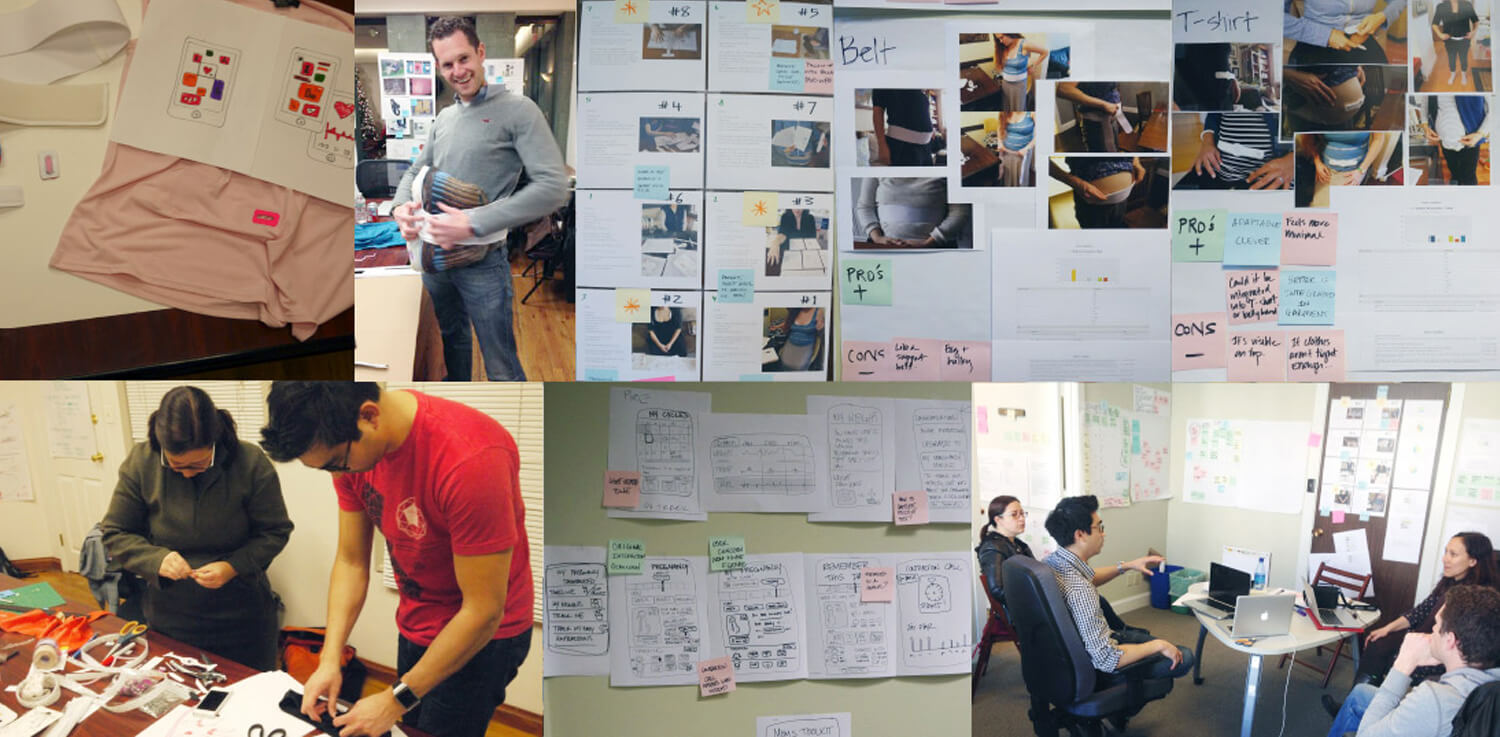
03 . Wireframing
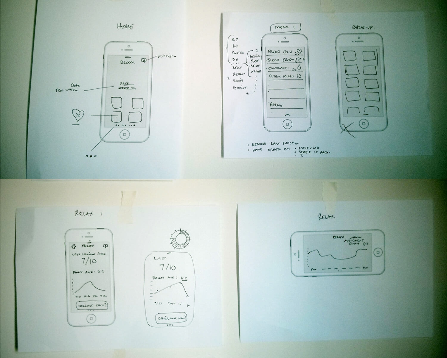
Wireframes + Flows. First architectural draft. Initial sketches where the first ideas where dropped in.
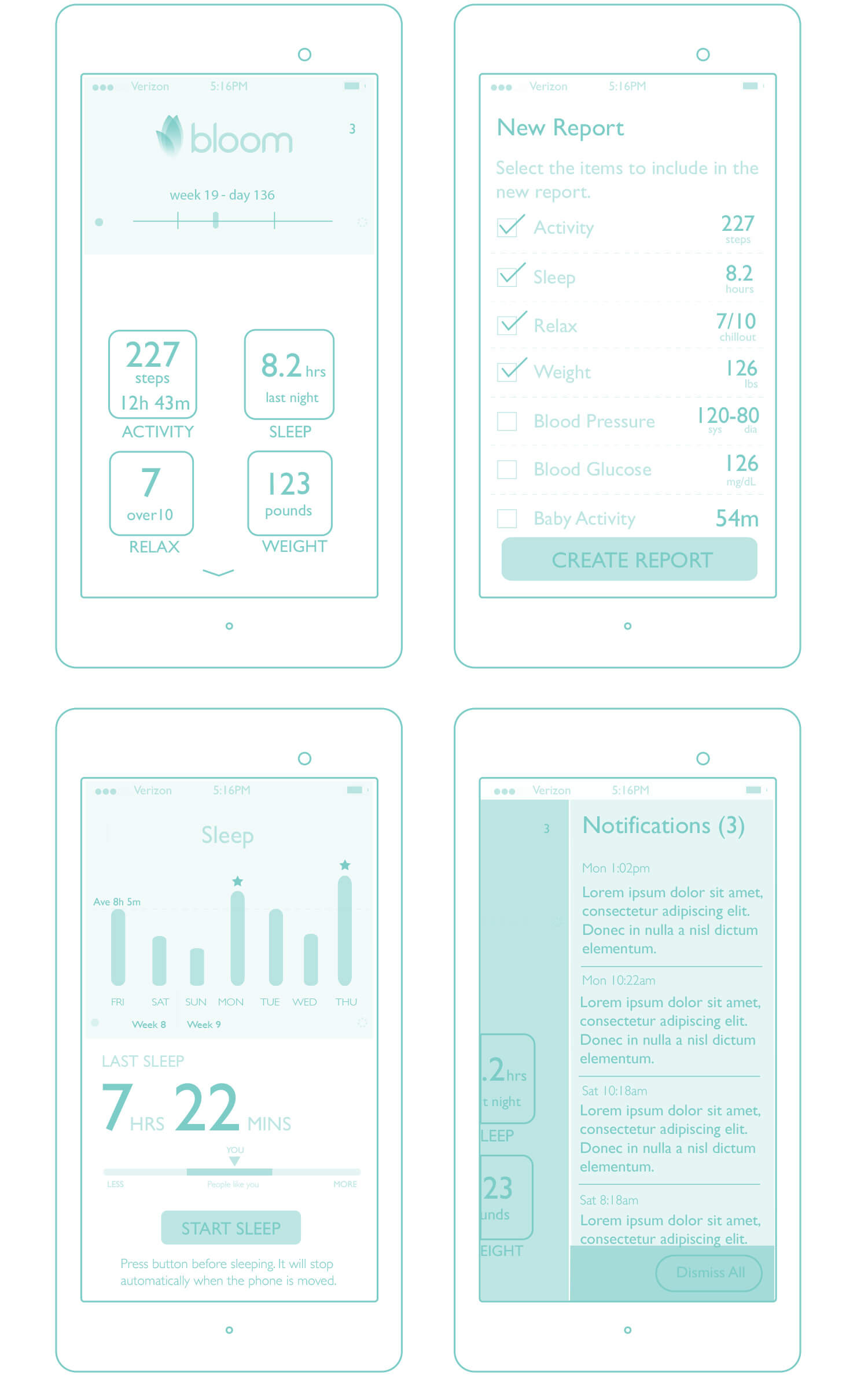
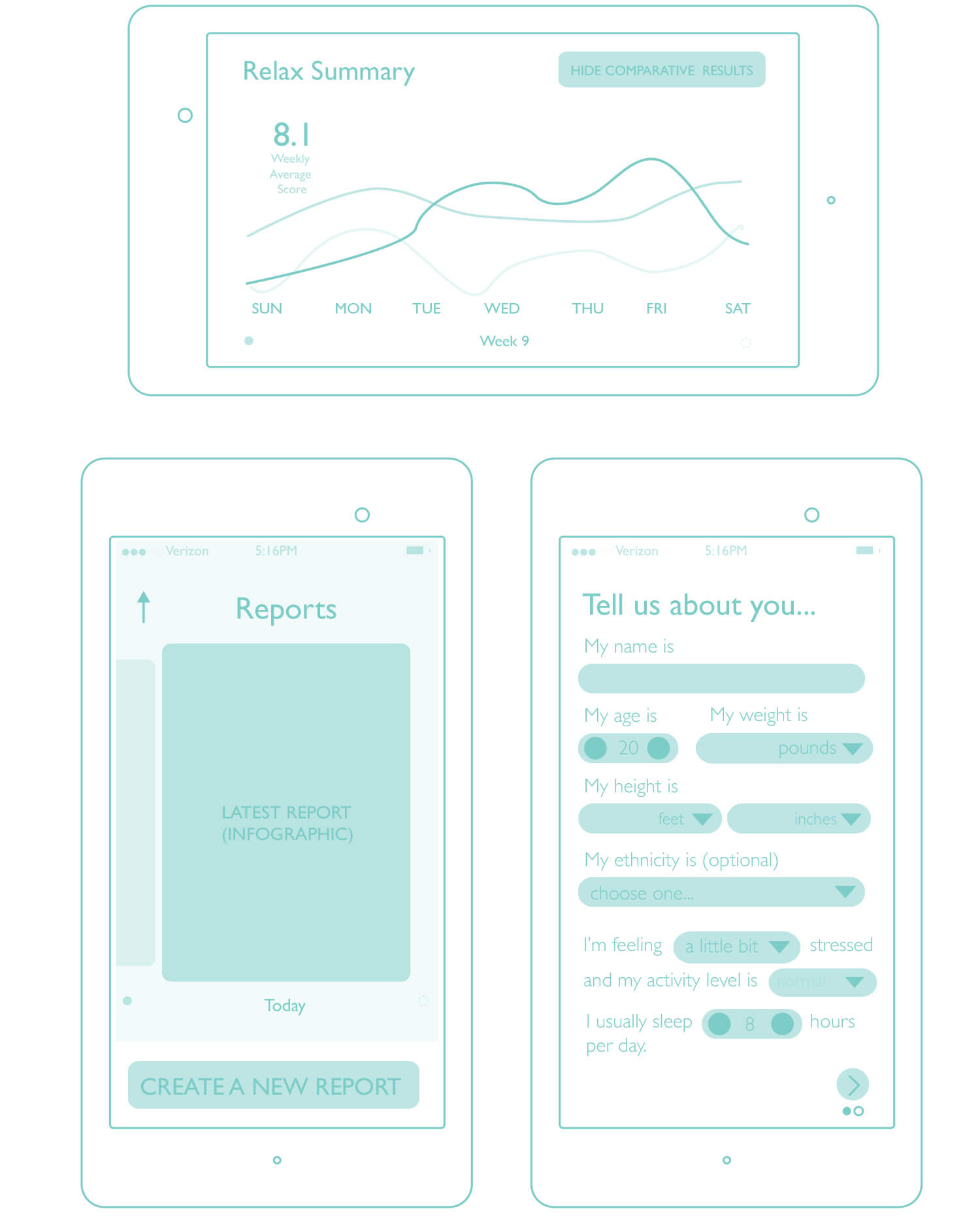 Hi-Fidelity Wireframes. Worked closely with Rafa Adinolfi, who was in charge of this specific area.
03 . The sensor: Industrial Design
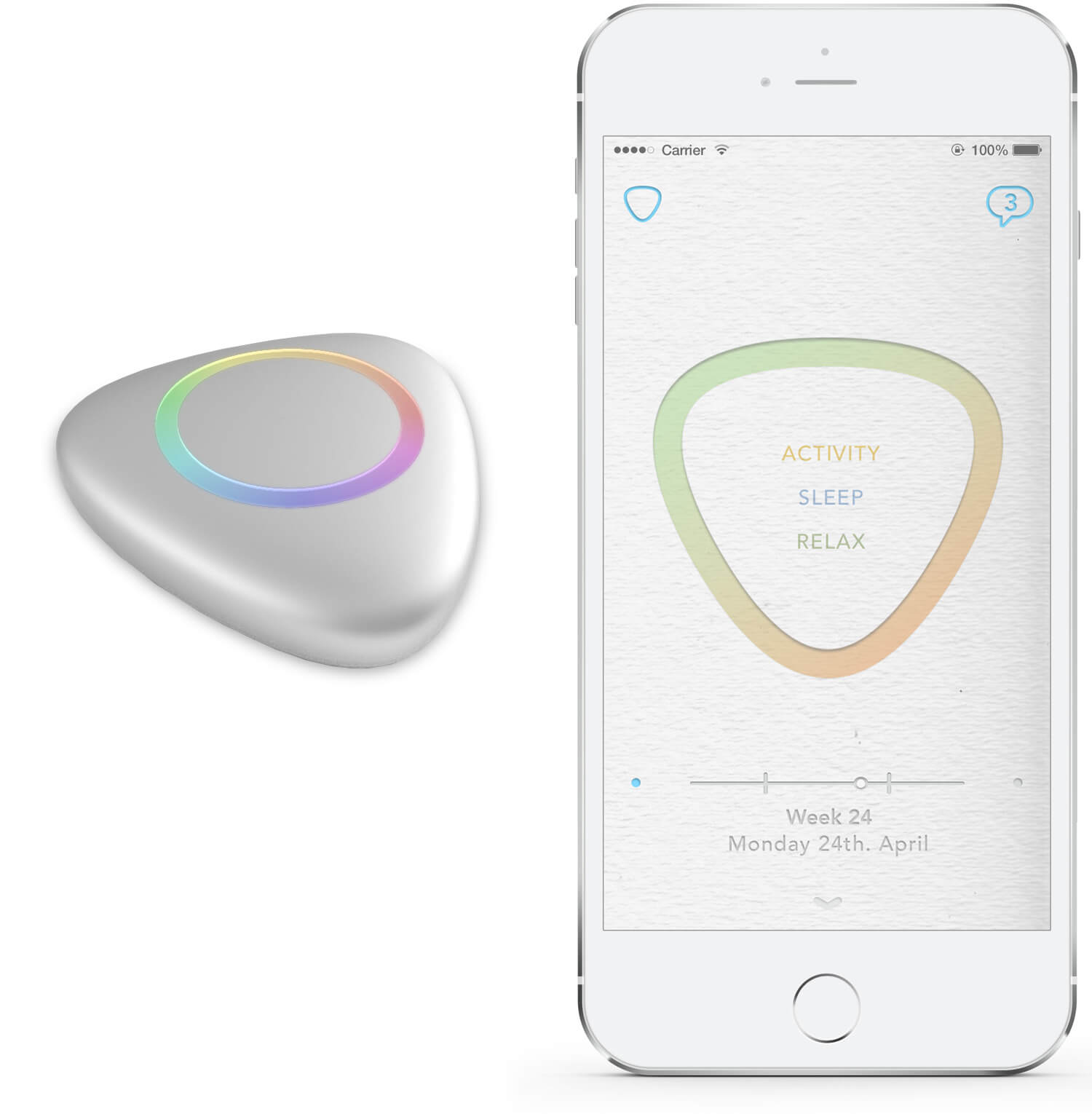
Development of the wearable hardware and its ergonomic design. An outlining of how the software and hradware would interact.
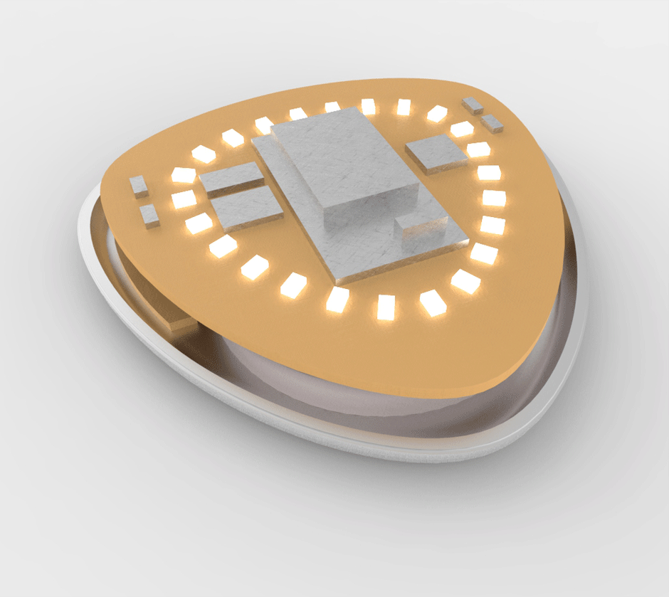
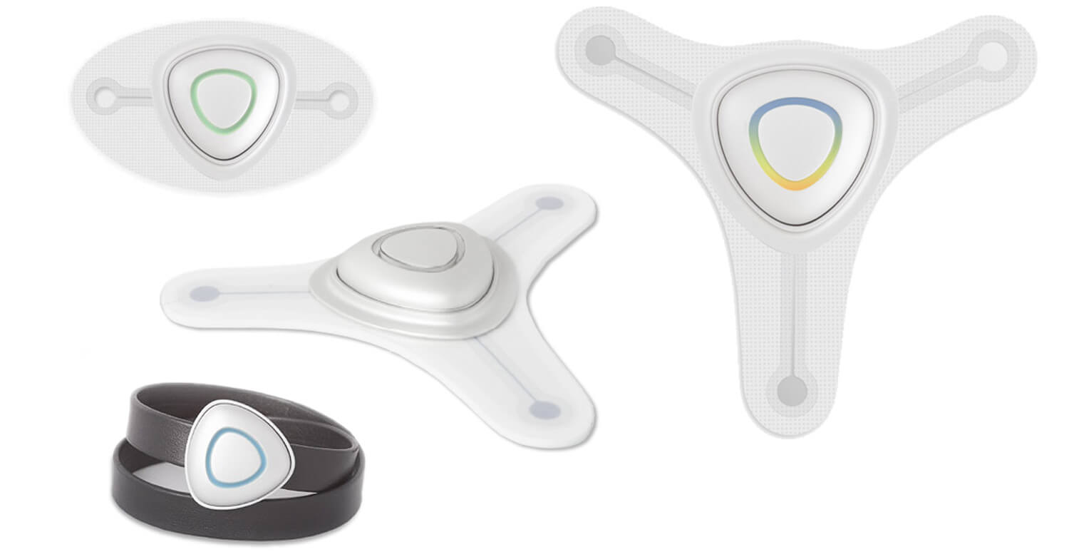
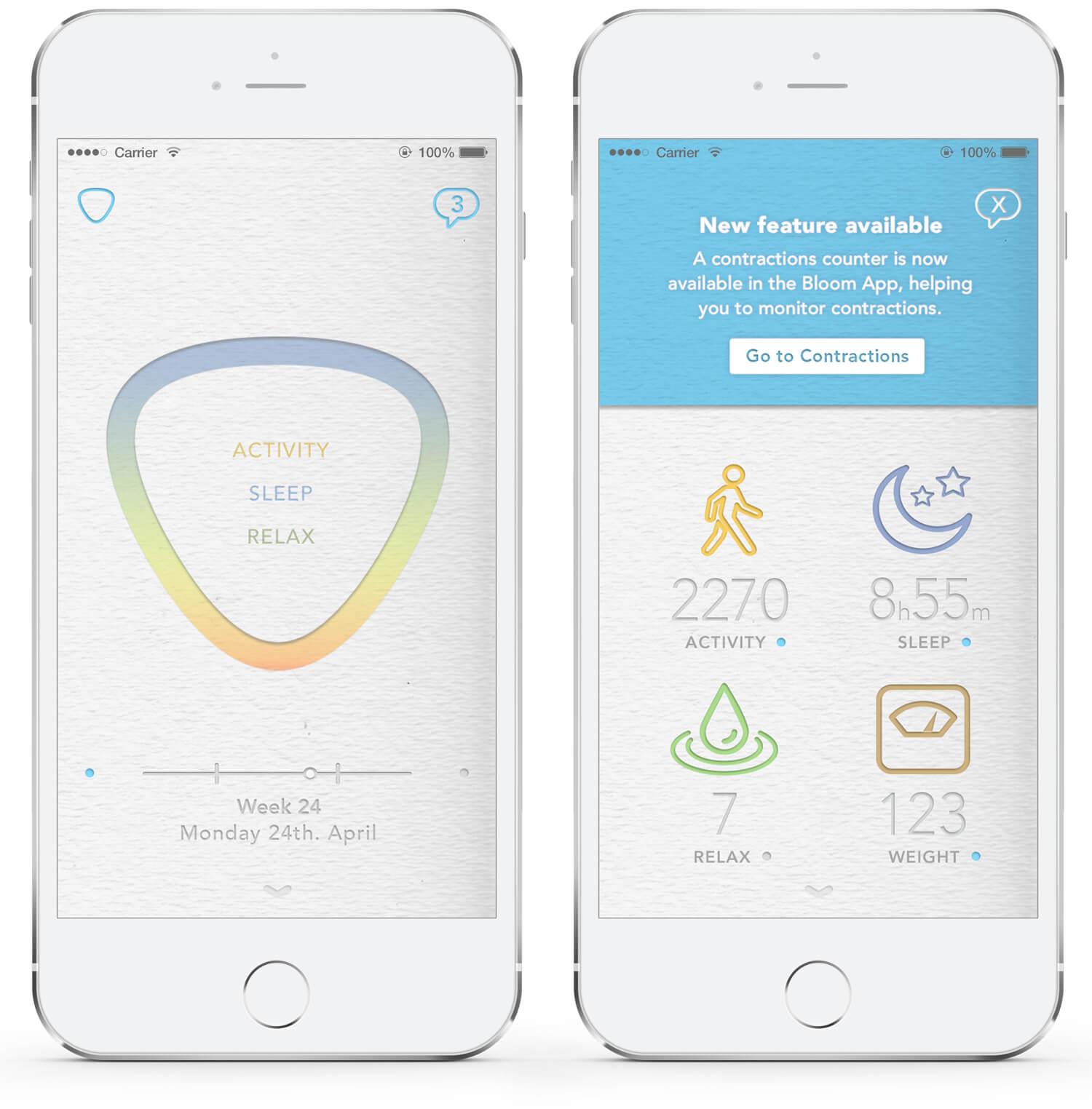
The sensor adapts into different gadgets in order to get a variaty of data during the pregnancy periods: Contraction Patch / Fetal Activity Patch / Wrist Strap
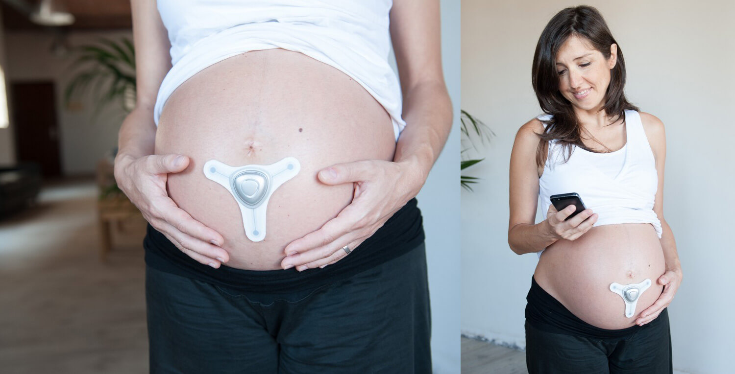
Bloom's sensor technology allows them to obtain a range of data from the body depending on where the sensor is worn: on the belly, the wrist or the chest, but it was the data around contractions that would become their primary focus.
Cohesive design over the multiple elements and shapes that emphasize the user and branding experience.
04 . Visual Design
Challenges:
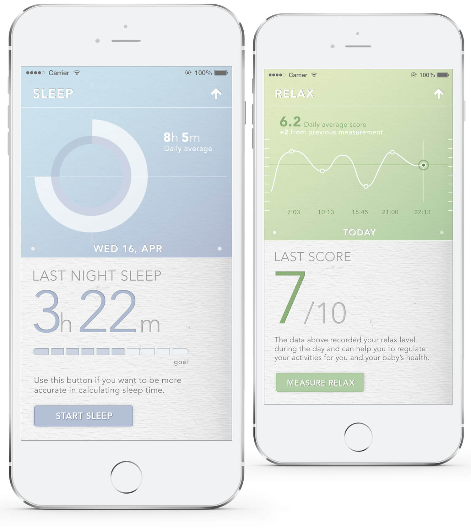
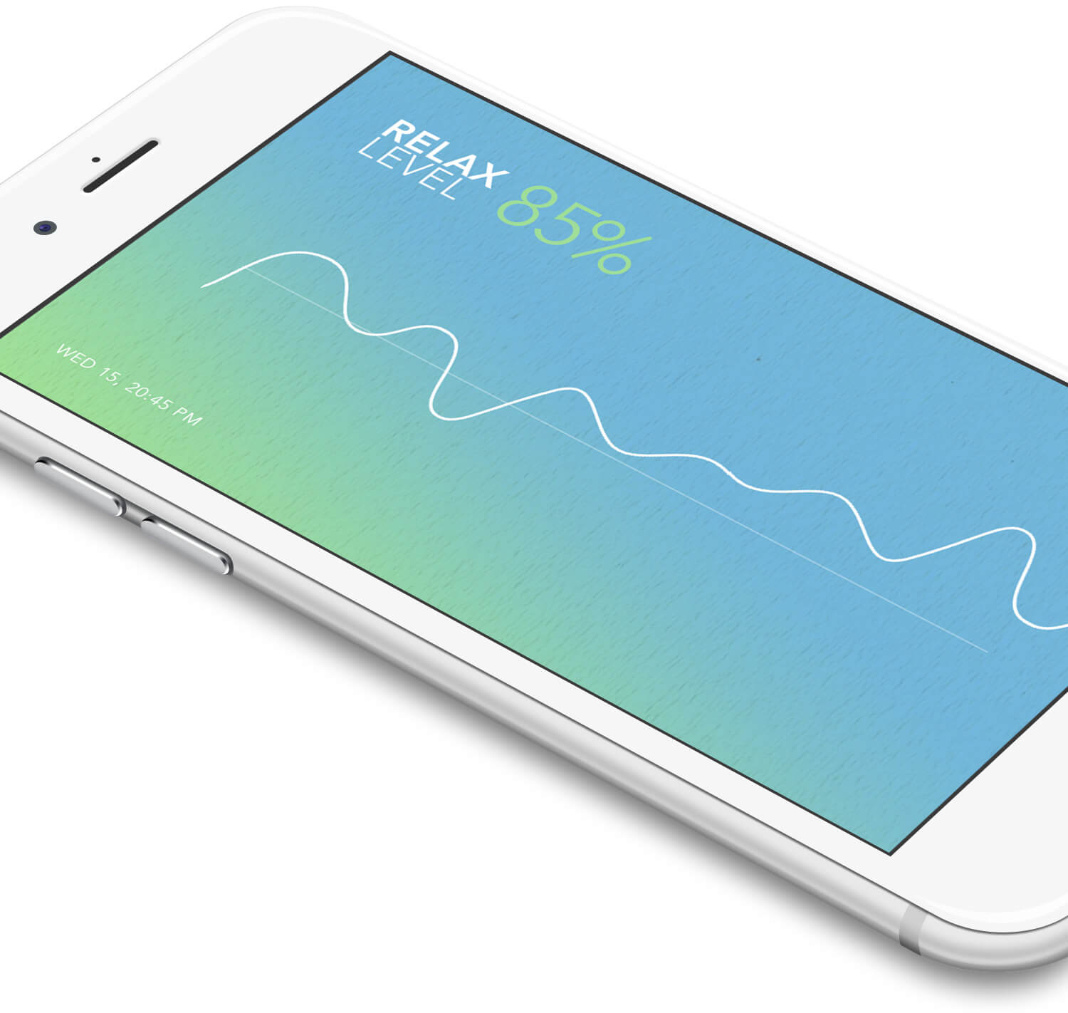
• It had to render precise infographics and detailed technical data with ease and simplicity in a manner that was sensitive to those undergoing a pregnancy.
• Designing an App that could communicate various sets of data in a simple fashion. Every stage of the UX was carefully crafted to render a highly cohesive experience.

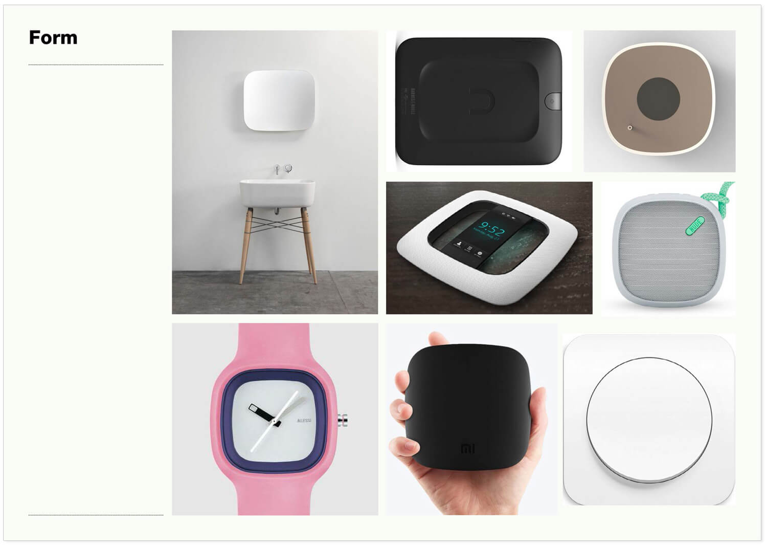
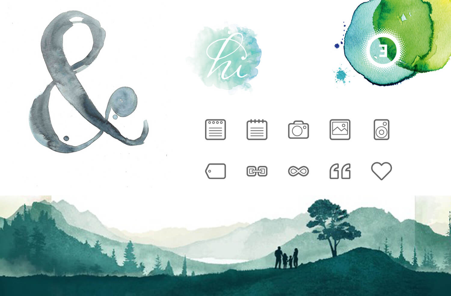
Moodboards.
As part of the initial creative process, a set of different moodboards were prepared. Ingredients such as forms and shapes, voice and tone, ad-like objects, textures, colors, interactions and interface patterns, among others.
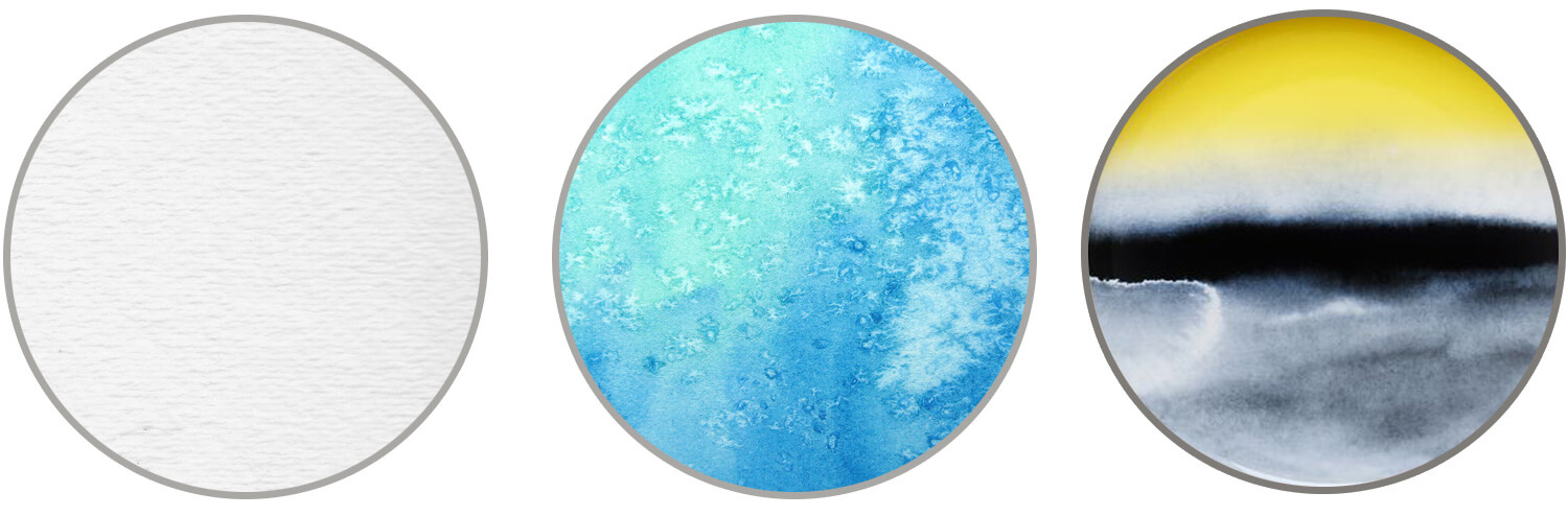
Inspirations. Watercolors, transparencies, and textures were the seeds of our visual metaphor.

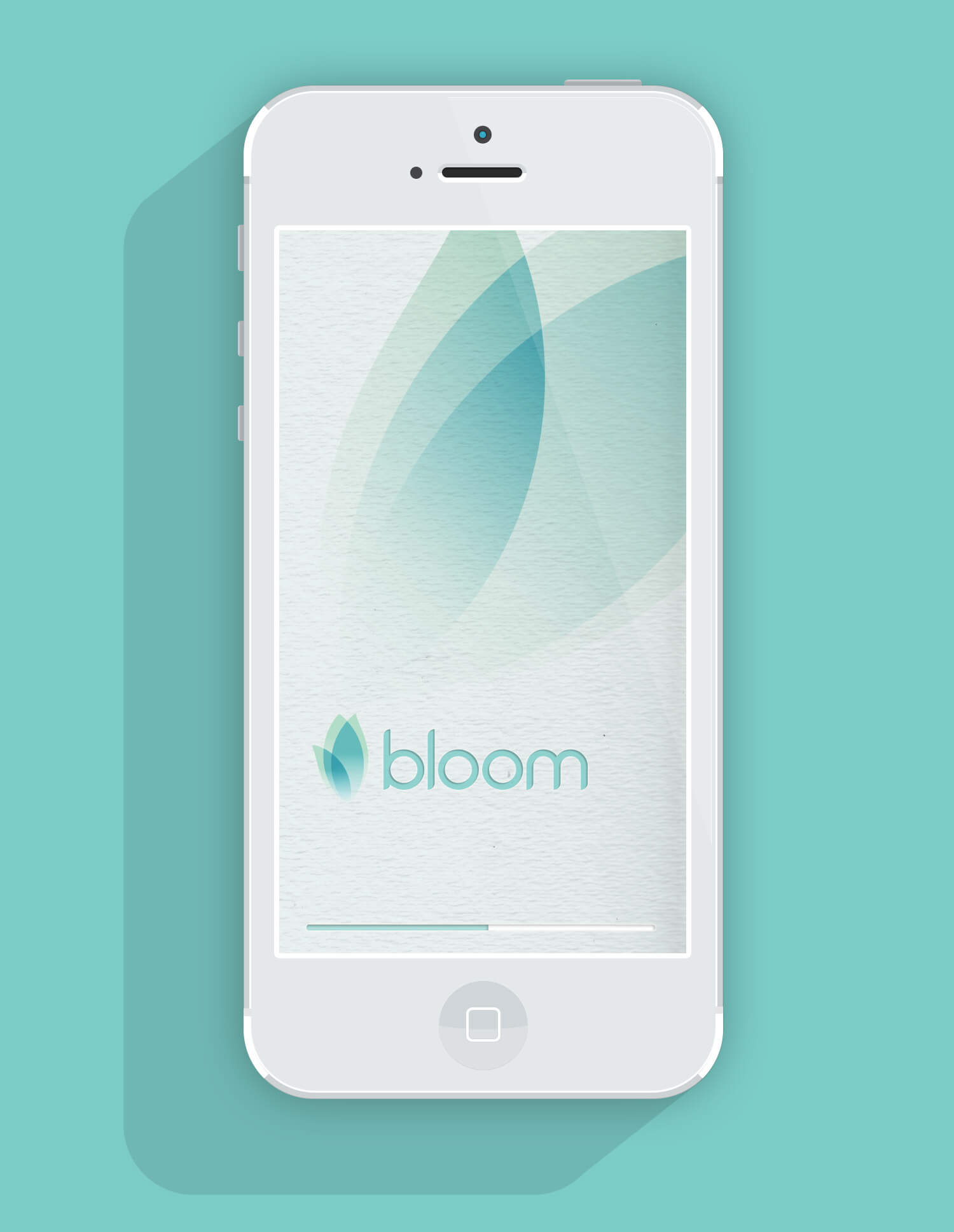
Landing page. A minimal look & a breezy feel.

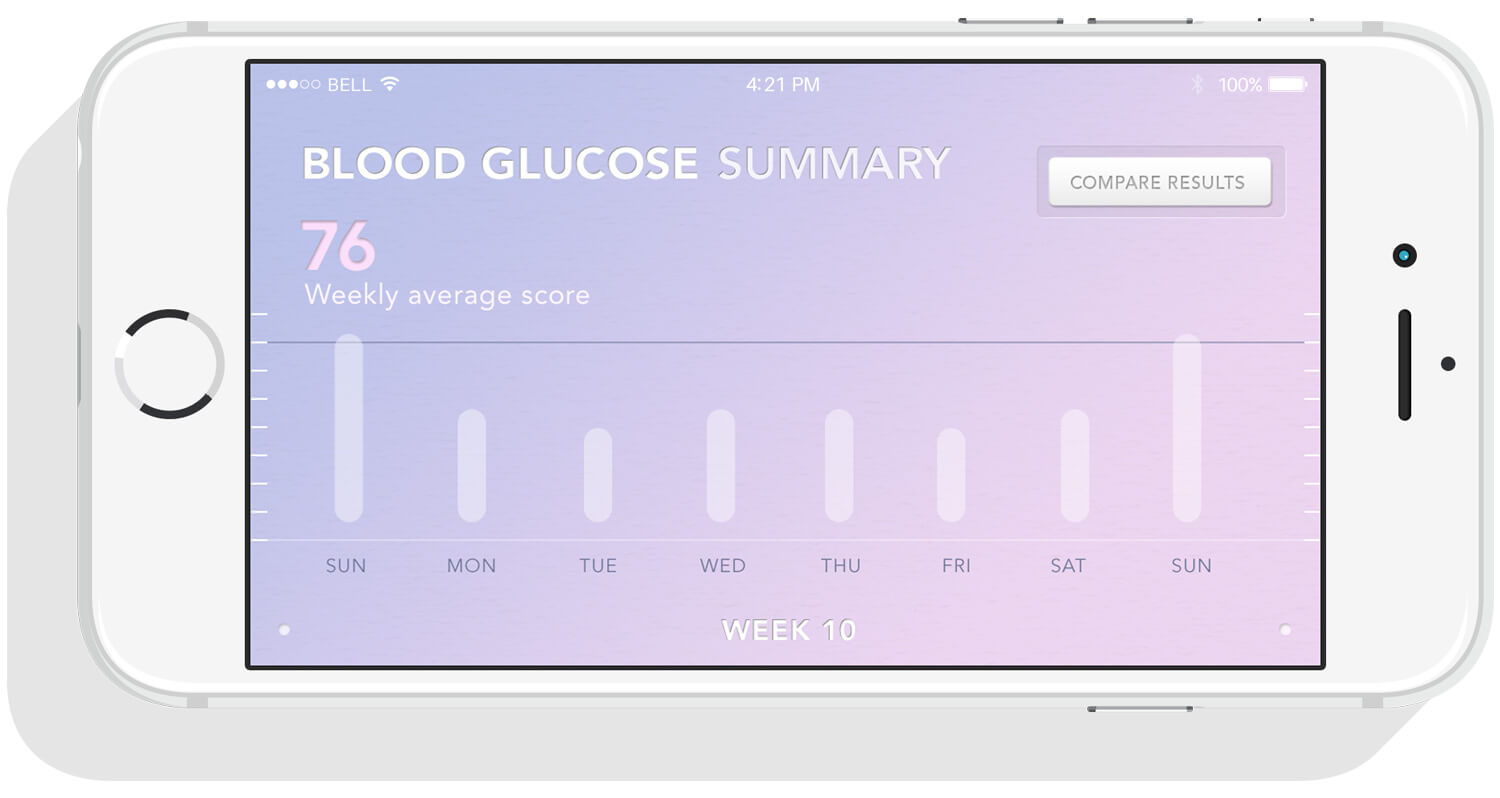

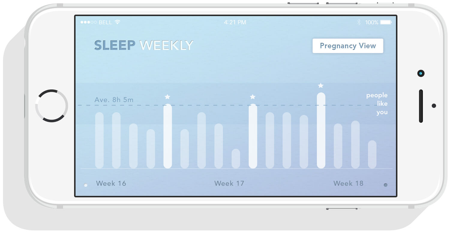
Horizontal view. Allows for a detailed infographic.
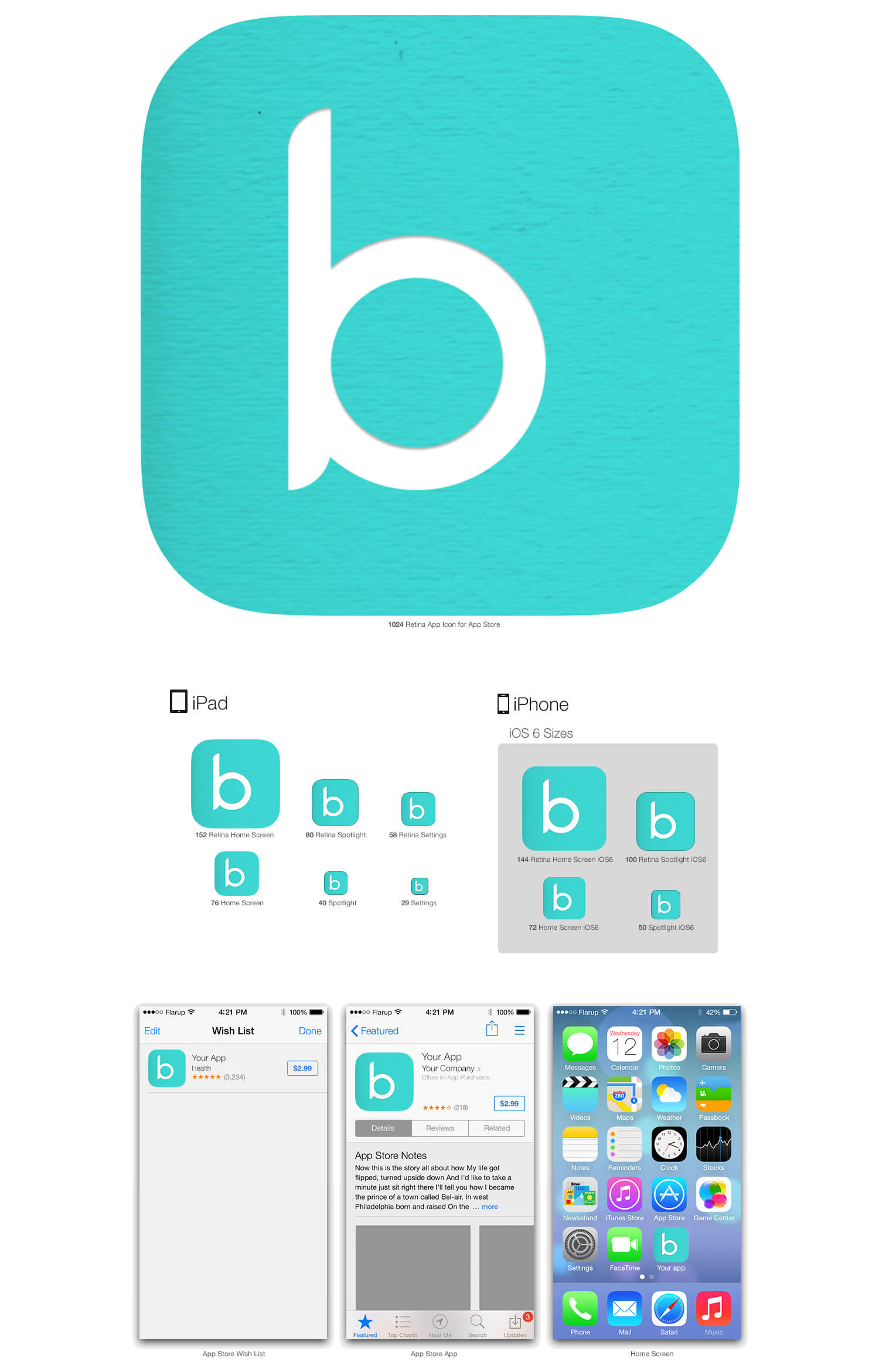
Icon. Designed for the different devices and platforms.
04 . Before Implementation
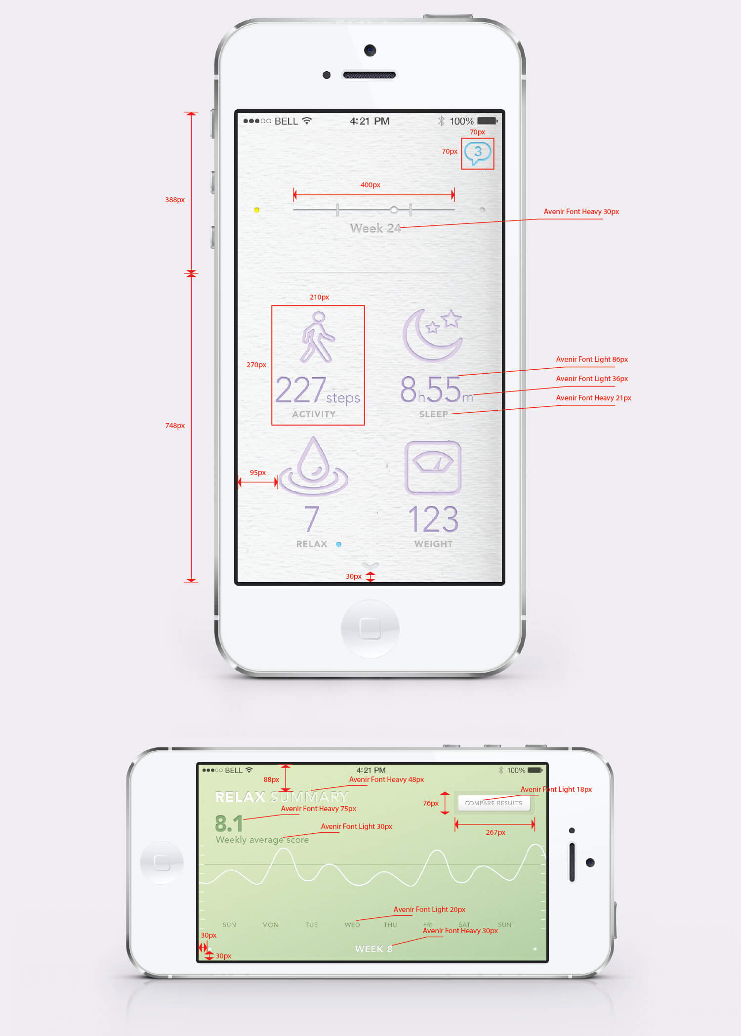
A pixel perfect specs were put together in order to avoid any communication gaps with the tech department
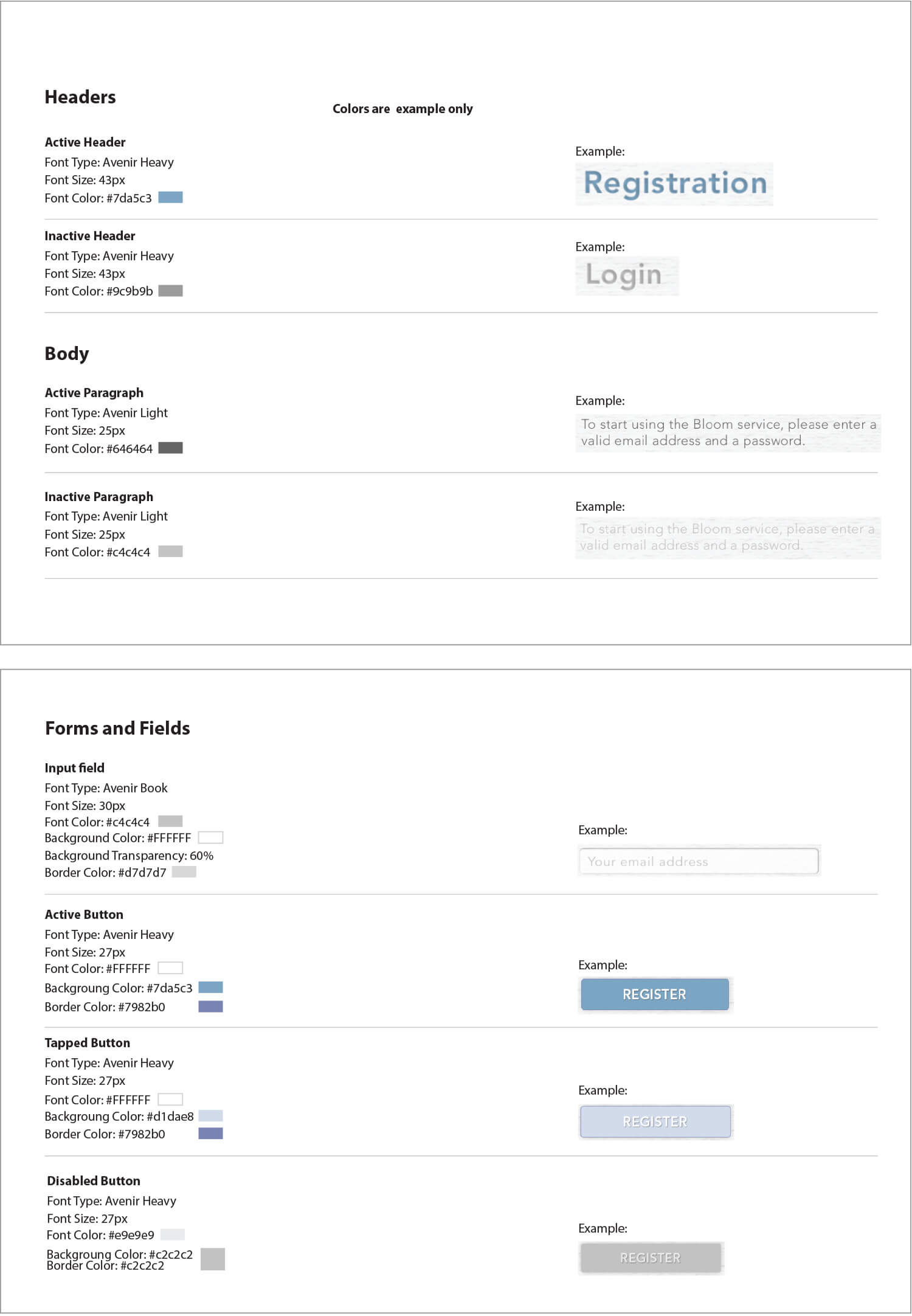
The System: creation of the Style Guide ensures the correct implementation of the final approved design.
Conclusions / Solutions
Bloom went live at the major Samsung Developers Conference in November 2014, winning the competition for best startup. They have had tremendous feedback on their product so far, and will be fully launching in 2015.
This was one of those occasions in which your own personal experience becomes a source of inspiration. Having had two children of my own, I was susceptible to the needs and concerns that a pregnant parent goes through. Therefore, I focused on creating a visual vocabulary that set the right tone without foregoing the need for simplicity and accuracy
Bloomlife.com + Zinc Group
We are cross-disciplinary team of scientists, engineers, doctors, designers but most of all parents who understand the physical and emotional roller coaster of having a baby.
Role + Location
UX / UI + Lead Visual Designer
Barcelona | Genk | San Francisco
Skills
- UI User Interface + Visual Design
- Multiplatform Mobile Apps & Multiplatfoms
- Art Direction Art & Creative Direction
- UX User Experience
- pixel perfect GUI Design + Pixel Perfection
- wireframes Wireframing
- Identity Identity & Brand Guidelines
- Typography Typography + Iconography
- web designs Web Design
- Interactive Design + Usability Interactive Design + Usability
- Information Architecture Information Architecture
- Ideation & Conceptual Development Ideation & Conceptual Development
- Creative Suitecase Creative Suitecase Ninja
- Projects Projects & Small Teams Leading